


A logo is a significant element of your brand’s identity. It’s crucial not to cut corners on this. Designing the perfect modern logo can be challenging, not because it’s difficult, but because the options are endless. Ultimately, it boils down to how you wish to be perceived.
A designer can only take you so far; you must grasp the essentials of your business and combine them with a visual representation that best reflects your identity.
Modern logos encompass a variety of styles. They can be minimalist, composed of just a few clean lines, or intricate, hand-drawn, and richly coloured with gradients. While logos evolve, the classics endure.
The essence of your logo is to identify your business or what it represents to your customers and stakeholders.
This article aims to guide you in determining the essential elements your logo needs to stand out and provide inspiration for you and your designer.
WHAT MAKES YOUR MODERN LOGO DISTINCTIVE
Creating a modern logo doesn’t mean abandoning classic styles. It means being prepared to compete in today’s market with a logo that is memorable, effectively communicates your story, is well-designed, and looks professional.
The best logos can adapt and evolve with trends and time, yet at their core remain solid and recognisable. When designing your logo, effective communication with your designer is crucial. Ensure clarity of goals and address any challenges along the way.
If you’re still uncertain about which aspects to prioritise, consider these points to ensure your logo stands out both now and in the future.
MEMORABLE TO ALL
A logo isn’t the same as a brand, but it serves as its visual representation. While a logo alone may not convey the entire essence of your brand, it should leave a lasting impression and intrigue people to learn more about your brand.
Some logos rely heavily on colour for identity, like Starbucks’ distinctive green. Even if the image or words aren’t immediately clear, the colour alone signifies its identity.
Other logos prioritise shape over colour, ensuring they stand out on any background or product, such as Nike’s iconic swoosh.
Memorability isn’t just crucial for brand identity but also for sales. How can people make repeat purchases if they can’t recall who you are? You don’t want to be just another “coffee shop” or “t-shirt” brand.
People remember things they understand and connect with, so keep this in mind when designing your logo.
SUCCESSFULLY TELL YOUR STORY
They say a picture is worth a thousand words, and your logo can encapsulate your company’s values and essence in this way.
Your logo should reflect what your company represents and the audience you’re targeting. Selling simplicity is challenging if your logo is overly complex. Likewise, if you’re an eco-friendly startup, your logo shouldn’t resemble that of a tech giant.
Are you friendly, serious, professional? All these qualities can be conveyed through your logo. Recognise your origins and present them effectively.
Tell your story. Successfully.
EXCEPTIONAL DESIGN
Now that you’re prepared to articulate your story, it’s time to design it. But how? What constitutes an “exceptional” design?
The best designer won’t necessarily create the best design. That’s because there’s no such thing as the “best” designer. Each designer has a unique approach, and it’s about finding the one who resonates with you the most, rather than aiming for absolute superiority.
You should seek uniqueness. Your logo should stand out as distinctly yours.
Additionally, simplicity is key. Your logo will appear everywhere, much like a signature representing your brand.
Lastly, consider versatility. Can it be simplified? How does it look in black and white? Does it maintain a clear silhouette? How about in print? Will the colour translate well on leather? Does it appear effective on a website or in an app store?
There’s much to contemplate.
PROFESSIONALISM FOR YOUR BRAND
Now that you’re all set and eager to commence with your compelling, inspiring, and persuasive logo, you might think you’re fully prepared. However, there’s more to consider.
It’s crucial that your logo exudes professionalism. It will serve as the face of your brand and business. You want people to take you seriously and ensure it doesn’t appear amateurish.
Choosing a poorly executed logo could undermine all your previous efforts. While it may be memorable, it might not convey the intended message and could alter your brand narrative.
Regardless of the style or colour you opt for, ensure it authentically reflects your values and identity. Never compromise on your logo.
That concludes it. You’re now ready to explore various modern logo designs.
TREND 1: MINIMALISTIC
Minimalistic is ranked first, and rightly so, as it epitomises the ultimate modern logo. It’s sleek, clean, and easily comprehensible—qualities highly valued in today’s fast-paced world where big content is expected in small packages.
Opting for a simple logo allows you to convey your story with professionalism. Established brands have revamped their logos to simplify them without sacrificing their identity.
For instance, Dunkin’ Donuts dropped the “donuts” from their name, simplifying their logo while retaining their distinctive colour palette.

https://www.dunkindonuts.com/en
Similarly, Microsoft Windows has progressively simplified its logo, moving towards a cleaner design while maintaining its recognisable identity.
https://www.microsoft.com/en-us/
The minimalist trend combines classic aesthetics with modern sensibilities. There are countless options and examples, but the core principle is simplicity in both words and design. This can be achieved through symbolic logos, simple text within a box, or an icon paired with text.
Explore a few examples below.
SYMBOLS
Not all logos represent brands or businesses; some signify movements or organisations. Consider the breast cancer awareness ribbon, instantly recognisable by its pink colour, whether worn as a ribbon, pin, or sticker.
The minimalist design of this logo ensures versatility across different forms, all while communicating its purpose effectively.

The essence of such logos lies in their shape and colour—elements crucial for defining your identity. For instance, the Microsoft Windows logo is identified by its window shape, allowing it to remain recognisable even with changes in colour.
These types of logos are particularly effective for larger organisations. While a coffee cup might seem generic for a coffee shop, an icon like Starbucks’ mermaid logo establishes a stronger and more unique identity.
While the design process for minimalistic logos may seem straightforward, brainstorming for the perfect concept can be a more intricate task.
https://www.supremenewyork.com/
JUST TEXT-IN-A-BOX
Opting for a text-in-a-box logo signifies simplicity, sophistication, and professionalism. It’s achievable even without a designer, focusing on simplification rather than reduction.
Experiment with varying text sizes relative to the box, along with different line thicknesses, slants, or cropping techniques. Consider the impact of black and white versus incorporating signature colours, and deliberate over font choices.
Take the example below, where a very basic font and colour have made a significant impact in the fashion industry, collaborating with other brands and standing out.
Of course, you can draw inspiration from this approach and explore different shapes—circles, ovals, rectangles, hexagons, and beyond. Use the box to encase your text or as a background; the possibilities are endless. Our goal is to expand your creative horizons and inspire.
ICON AND TEXT
In the past, logos often featured overlapping shapes, geometry, icons, and text. Today, however, there’s a preference for clearer distinctions. This ensures logos are simpler and more adaptable.
The separation between the icon and text clarifies both the name and logo of your brand. Your logo can consist of the icon alongside text, just the text itself, or solely the icon.
This versatility is crucial in today’s media-rich environment. Your logo needs to look exceptional on screens and on any merchandise or products you distribute, whether internally or externally.

An icon and text combination also lends itself well to animations.
While pairing text with an icon is a classic approach, positioning them distinctly with clear borders and space between them is the modern trend.
Modernisation isn’t about drastic change; it’s about refining what already works to better fit contemporary needs.
TREND 2: POP OF COLOUR
https://www.fedex.com/en-us/home.html
The next trend in modern logo design focuses on colour. You can opt for vibrant hues or a simpler colour palette, incorporate overlapping colours, or stick to monochrome.
Your choice of colours can define both your logo and brand identity. It’s essential to integrate this with the principles of minimalism.
Your colours should remain versatile enough to be used in various applications while maintaining your brand’s identity. Take Nike’s distinctive orange-yellow, for example. It instantly identifies the brand across different products, from store signage to packaging. Consider switching to reusable bags to help the environment while promoting your logo.
Meanwhile, the Nike logo can be white, blue, or a gradient, yet it remains recognisable.
A simpler logo can be deconstructed while still retaining its brand essence through each element.
Explore how different colour applications can enhance your brand’s visual identity.
USE BRIGHT COLOURS
Bright colours capture attention effectively. The key is in their combination to maintain a professional appearance.
Take the Chrome logo, for instance. The combination of red, green, and yellow might not seem ideal, but they harmonise well to distinguish the Chrome logo without looking amateurish.

The strategic placement enhances the overall logo. The simplicity of the shapes allows the colours to add depth. Conversely, a complex design with colourful leaves on a tree could confuse the logo’s message.
Another example is the FedEx logo, where the use of purple, white, and yellow creates a distinctive look adaptable across various media. Purple can replace white as negative space or complement other icons in FedEx’s documents.
Studying colour harmony or consulting with your designer can significantly enhance your logo.
Establishing an identity colour elevates your design without needing a complete redesign each time.
SELECT A SIMPLE COLOUR PALETTE
Colours, like designs, offer endless inspiration, making the choice challenging.
For more intricate designs, a simpler colour palette may be beneficial, especially for companies with diverse product lines.
Consider the example below where various shades of yellow were creatively employed.
Using colour palettes effectively aids product recognition without the need to read labels.
A signature can take many forms; choose one that sets you apart to avoid being derivative, which could undermine your brand’s integrity.
Once you establish a distinctive identity, consistency is key, even if the logo evolves over time. It should retain its core identifying features.
EXPERIMENT WITH OVERLAPPING COLOURS

https://www.mastercard.us/en-us.html
Now that we’ve explored combining colours while maintaining minimalism and versatility, let’s experiment with overlapping colours.
In the example above, a palette of overlapping colours demonstrates how similar hues like pink, red, and orange harmonise well. Even combinations like blue and green, or blue and pink, can work effectively.
To keep a modern look with combined colours, limit the palette to two or three colours, adding flair while maintaining professionalism. While experimenting with four or five colours is possible, avoid overwhelming potential customers.
Consider the Mastercard logo. While solid colours may seem more modern, the overlapping technique in their logo design enhances its modernity.
This example illustrates that how you combine colours is as crucial as the colours themselves. Despite updates, Mastercard maintains its distinctive identity.
Hopefully, this inspires you to choose a timeless design for your logo.
MONOCHROME
Monochrome logos offer a versatile alternative, particularly for responsive design.

Starting with a coloured logo and providing a monochrome option ensures a comprehensive design set.
Monochrome enhances complex designs by allowing clarity while maintaining a consistent message to your audience.
The Apple logo provides an example of consistency with its monochromatic design, adaptable across all surfaces.
Each logo trend should reflect the core elements that define a great logo.
TREND 3: COLOUR TEXTURES & PATTERNS
The next evolution after experimenting with different colours and layers involves textures and patterns. Your logo can be enhanced with gradients, textures, and even intricate patterns.
If you’re satisfied with your experiments using solid colours, you can skip this section and move on to the next trend. However, if you’re eager to explore further colour possibilities while maintaining a modern and professional look for your logo, consider a few inspiring examples here!
GRADIENTS
Gradients are a fantastic way to blend different colours, adding depth to your logo even in an era favouring flat designs.
A notable trend in gradient colours is the bold combination of vibrant hues to make a striking statement.
A prime example is the evolving Instagram logo, which retains its camera shape as its signature, despite changes in colour over time.
Similarly, the iTunes logo, although older, incorporates gradients subtly yet effectively.
For those keen on exploring gradients, the Tinder logo effectively uses fiery gradients, aligning well with its brand imagery.
This demonstrates that colour gradients can enhance your logo’s versatility while giving it a modern twist.
TEXTURES
Another technique involves adding texture to colours. The image provided offers a simple yet versatile example of how colour textures can create a three-dimensional effect for your logo.
Textures can be applied as solid colours with added shadows for a more pronounced 3D appearance, serving as backgrounds for your logo or enhancing the colours of its text and icons.
Experiment with watercolours, digital effects, or natural photography to create unique textures, such as a crumpled paper background.

Colour textures are effective for responsive logos, as they can be simplified or removed as needed.
The modern approach to colour textures involves combining them with solid colours or bold outlines, emphasising clarity and purpose in design.
PATTERNS
Patterns add an intriguing dimension to logos, either as overlays or integrated elements.
They can be embossed or treated as visual effects, offering a contemporary edge without appearing garish.
Consider using your logo as a repeating pattern, as seen in many fashion brands like Chanel, Supreme, and Louis Vuitton, enhancing their clothing, bags, and packaging.
Well-designed patterns can enhance logo memorability, making them more distinctive.
TREND 4: RESPONSIVE LOGO
We now delve into the trend of responsive logos, a significant movement in the realm of modern design. Responsive logos complement modern aesthetics seamlessly.
Modern logos must stand out in a world saturated with captivating designs, from print media to websites, buildings, and even pavements. They need to be memorable, straightforward, and eye-catching.
The concept of responsiveness is crucial due to the diverse media landscape of today. Logos must adapt to various formats such as posters, digital feeds, news platforms, images, merchandise, calendars, and architectural displays.
In the example above, each logo comprises three main elements: the icon, the name, and the colour. This simplification process may involve stripping away elements like the name, illustration, icon, or pattern, while retaining a signature colour, emphasising its importance discussed in the previous sections.
Not all logos are inherently responsive. Some are inherently simple, while others cannot afford to lose any components without losing their identity.
The advantages of having a responsive logo outweigh the challenges. A responsive logo ensures versatility across different media platforms, enhancing visibility and adaptability. However, creating such a logo demands considerable effort and inspiration from a skilled designer.
Not every startup may initially afford this investment, especially if their needs are straightforward and do not necessitate responsive features. Nevertheless, in today’s tech-driven world where users switch between phones, tablets, and laptops, a responsive logo that adapts seamlessly to any screen size can offer a competitive advantage.
It’s worth noting that logos can evolve over time to meet changing needs, thereby becoming responsive in their own right.
TREND 5: USE POSITIVE & NEGATIVE SPACE
Positive and negative space logos are refreshingly simple yet effective. Here are a couple of examples that might inspire your logo design journey.
Take a look at these logos where each letter incorporates negative space cleverly shaped as a wrench and a thumb. The negative spaces form positive shapes as well.
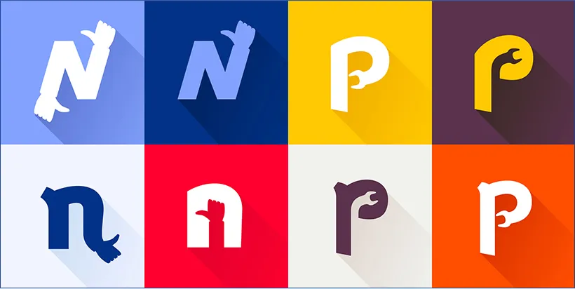
This represents the basic form. You can experiment with other shapes too. For instance, imagine a mountain within the letter A if your business is about adventure, aptly named ADVENTURE. It’s simple yet makes a striking impression.
The reason this technique works so well is that it adds a unique twist to your logo while maintaining simplicity, modernity, and professionalism.
Further exploration reveals that negative and positive spaces can also be creatively utilised in packaging. For instance, the colours on your beverage packaging could reveal different logos as the contents are consumed.
Considering this, negative and positive spaces can enhance not only your logo but also your packaging and overall design profile. Seek more examples for further inspiration.
As mentioned earlier, the major advantage of this trend lies in its ability to create uniqueness and memorability. It also allows your brand’s creativity to shine through, particularly beneficial for fields like design, accessories, and apparel.
However, the risk involves unintentionally resembling another logo. If uncertain, exploring alternative trends can still yield inspiring results.
Trend 6: Typography
Typography represents a realm of logo design where the emphasis is placed on words themselves, alongside their font style. A standout example is Disney, where the iconic “Disney” logo hinges on its distinctive “D” font. Typography allows for creative manipulation such as cropping letters or customizing fonts, presenting both challenges and opportunities for designers.
Cropping letters can give a logo a modern edge, though excessive cropping risks appearing overly futuristic unless intentional. It’s a trend that suits businesses seeking a sleek, cutting-edge identity, utilizing fonts ranging from thin to bold, and exploring monochrome, vibrant colors, or gradients. Precision in cropping is key to transforming a simple business name into a memorable logo.
Lettering is a broader approach within typography, altering how letters are arranged—whether curved, boxed, or stacked vertically—creating minimalistic, monochromatic logos that still captivate.
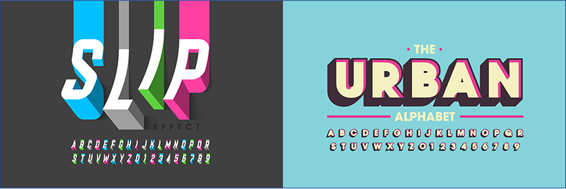
Custom fonts are integral to this trend, allowing designers to craft unique typographic identities. They offer versatility across various applications, from brochures to websites, facilitating easy modifications while maintaining brand consistency.
Each font choice influences how a brand story is conveyed, whether through darker tones and bolder fonts or lighter hues and finer lines. The goal is always to ensure the logo stands out while remaining true to its narrative.
Trend 7: Geometry
In logo design, geometric shapes like circles, squares, and lines play a crucial role beyond mere illustrations or icons. These shapes can be utilized to frame text, enhance typography, or serve as integral parts of the logo itself, offering a clean yet memorable aesthetic.
For instance, construction companies often use angular lines to symbolize buildings, while pie sellers can employ geometric shapes creatively to evoke their product. The essence of geometric elements lies in their ability to elevate a simple logo while retaining its fundamental simplicity, often lending a modern touch or even a vintage feel.
The versatility of squares, as demonstrated by Domino’s logo, extends beyond mere containment for text; it serves as an icon and integral part of their visual identity, adaptable across various media. Similarly, circles are exceptionally versatile in logo design, capable of functioning as borders, icons, or standalone logos, as seen in brands like Line, Internet Explorer, Xbox, and Chrome.
Lines, meanwhile, offer limitless possibilities for forming geometric or abstract shapes within logos. Whether used to outline text, create intricate line art icons, or simply add a touch of sophistication, their simplicity enhances the logo’s modern appeal. Thin or thick, straight or curved, lines can be manipulated to convey different moods and aesthetics, making them a staple in contemporary logo design.
By incorporating geometric shapes thoughtfully and experimenting with their arrangement and color, designers can achieve logos that are not only visually appealing but also effectively communicate brand identity and ethos.
TREND 8: VINTAGE
Did you know that vintage designs are actually considered modern logos? Many startups gain traction and become memorable precisely because of their vintage-inspired logos.
This approach works by blending the newness of a company with the nostalgic appeal of an older aesthetic. There’s something intriguing about this contrast that attracts people’s attention.

Vintage logos typically fall into two main categories. The first type features intricate illustrations with numerous lines, shapes, icons, and text. This style evokes a rustic, handcrafted feel that can set a brand apart. However, amidst this complexity, it’s crucial to identify a focal point—a standout icon or distinctive typography—that resonates with your audience.
For example, brands like Jack Daniel’s and Stella Artois use heavily illustrated vintage logos to emphasize their heritage and craftsmanship.
The second type of vintage logo is characterized by clean, brightly colored identities. This approach is particularly interesting because it reflects a return to the bold use of colors that was popular in historical logo designs.
Today, modern brands adopt both colorful and monochromatic vintage logos to tell their stories effectively. The advantage of a vintage logo lies in its ability to enrich your brand’s narrative and convey a specific impression to customers.
However, the challenge lies in maintaining authenticity. With multiple elements in a vintage-inspired logo, there’s a risk of losing clarity and diluting your brand identity. Unlike simpler logos that rely on stark minimalism to stand out, vintage logos require careful curation to ensure they remain cohesive and memorable.
In summary, vintage logos offer a powerful way to blend tradition with contemporary appeal, but achieving a balance between complexity and clarity is essential for their effectiveness in modern branding.
![]()
TREND 9: HAND-DRAWN LOGOS

Hand-drawn logos come in many forms and can be a great source of inspiration. Opting for a hand-drawn logo means you’re trusting your designer or adding a personal touch to your brand.
When you create hand-drawn logos, you’re opening up to a world of possibilities. A simple line drawing can give a rustic feel, almost like a vintage logo. You can also experiment with colour blending, overlays, and gradients using traditional tools like paint or colour pencils.
Hand-drawn logos range from simple line art to intricate graphic illustrations. Modern logos often embrace hand-drawn styles because they’re unique. For instance, a hand-drawn Christmas tree for a holiday logo can make a big impact. It’s individual, playful, and adds a touch of professional aesthetic.
However, the quality of your logo depends heavily on the skills of your designer. Each designer has their own style. While it’s possible to create your own hand-drawn logo if you’re confident, without a solid understanding of artistic principles, achieving a polished result can be challenging.
GET STARTED CREATING YOUR OWN MODERN LOGO
Now that you’ve explored all the different modern logo designs you can experiment with on your own – from minimalistic styles to typography, geometry, hand-drawn designs, and more – you understand how essential your logo is as the face of your brand. Remember, branding extends beyond just the logo; it’s crucial for your business success.
Feeling inspired? If so, it’s time to start crafting your logo. Once you have it ready, begin applying it wherever possible to enhance brand recognition. You could even incorporate your logo onto phone cases to ensure it’s visible daily.
If you already have a logo, consider printing it on various cases – practical and purposeful.
Elevate your brand by customising logo cases today.
Have a specific design in mind? Request a quote now. Contact us for details. Let’s get started.

Bhushan spent the last 15+ years building businesses and learning what really matters to customers. At Custom Logo Cases, we help brands turn everyday tech accessories into high-quality, on-brand marketing tools.


🚨 Attention K-12 Tech Directors & Admins! 🚨
Secure your 2026-2027 deployment before the summer rush.
We just launched our new, ultra-rugged 360° Protection Case built specifically for K-12 Chromebooks and the Apple Neo.
Why This Case?
Drop-Proof: Military-grade 360-degree shock absorption.
Student-Proof: Reinforced corners and pick-resistant port covers.
Versatile: Full rotation for tablet and laptop modes.
⏱️ Act Fast for August Delivery ‼️‼️
Supply chains tighten drastically by June. Order by May 31st to guarantee delivery and tagging before students return this August 2026. ... See MoreSee Less
Call Now
... See MoreSee Less
Thank you @miamilawschool for the repeat order! Neoprene Outer Pocket Zipper Sleeve with Band and Felt Interior #laptopsleeves #CustomMerch #GradGift #TechAccessories #CustomBranded ... See MoreSee Less