


A logo is a crucial part of your brand’s identity. You don’t want to skimp on this. Designing the perfect modern logo can be tricky. Not because it’s hard, but because the options are endless. It all comes down to how you want to be perceived.
A designer can only take you so far. You must understand your business’s essentials and pair them with a visual that best represents who you are.
Modern logos can be a mix of many things. They might be something simple, with just a few strokes of lines, or even complex, hand-drawn, and full-coloured with different gradients. It’s true that logos evolve, but the classics always stick.
The most important aspect is that your logo identifies who or what your business is to your customers and stakeholders.
This article will help you figure out the elements you need in your logo to make it memorable, as well as provide some inspiration to help you and your designer get started.
What Can Make Your Modern Logo Stand Out
A modern logo doesn’t mean you abandon all classic styles. It just means you’re ready to compete in the contemporary market. You want a logo that is memorable, can easily tell your story, is well-designed, and looks professional.
The best kind of logo can adapt and evolve with trends and time. But at its very core, it’s solid and identifiable. If you’re ready to design your logo, it’s all about communicating with your designer. Make sure that you’re both clear on the goal and can address any issues along the way.
If you’re still struggling to figure out which points to prioritise, consider these aspects that will help your logo stand out and endure the test of time.
Memorable To All
A logo is not the same as a brand, but remember that your logo is the visual representation of your brand. Understanding the entirety of your brand may not always be possible with just the logo. However, you want people to see your logo and remember it, and possibly be interested in learning more about your brand.
Some logos rely heavily on their colour for identity. Even if the image or words aren’t very clear, the colour will convey its identity. For example, Starbucks and their signature green.
Other logos might focus on their shape rather than colour, so they can adapt to any background or design. Take Nike, for instance. This approach is effective because they produce clothing and accessories, and their logo stands out on any product.
Being memorable is not only important for your brand identity, but also for your sales. How can people make a repurchase if they don’t even know who you are? You don’t want to be just another “coffee shop” or another “t-shirt” brand.
People tend to remember things they understand and connect with. Keep that in mind while you work on your design.
Successfully Tell Your Story
They say a picture is worth a thousand words, and you can certainly achieve this by capturing your company’s value and essence.
Your logo will reflect what your company can do and the audience you’re trying to reach. It will be challenging to sell simplicity if your logo is complex. For instance, if you’re an eco-friendly startup, you can’t use the same image as a tech company.
Are you friendly? Serious? Professional? Your logo can translate all of these traits. Understand where you’re coming from and present that clearly.
Tell your story. Successfully.
Exceptional Design
Now that you’re set on telling your story, it’s time to design it. But how? What makes an “exceptional” design?
The best designer may not necessarily produce the best design. In fact, there is no “best” designer. Each designer will communicate with you differently, and it’s not about finding the best one, but rather the perfect one for you.
You want to aim for uniqueness. Your logo should be one of a kind. After all, it’s yours.
Next, you want it to be simple. Your logo will appear everywhere. Think of it as a signature – a mark that your brand will leave.
Finally, consider versatility. Can it be simplified? How does it fare in black and white? Does it have a distinct silhouette? How does it look when printed? Will the colour show on leather? Does it look good on a website or the app store?
There’s a lot to consider.
Professional For Your Brand
Now that you’re ready to start designing your attractive, inspiring, and persuasive logo, you might think you’re all set. Well, not entirely.
You need to ensure that your logo looks professional. Since your logo will be the face of your brand and business, you want people to take you seriously and make sure it doesn’t come across as amateurish.
A poorly executed logo can undermine all your previous efforts. You might be memorable, but it won’t convey the message you intended. And it can distort your story.
Whatever style or colour you choose, make sure it truly reflects who you are and what you stand for. Never skimp on your logo.
And that’s it. You’re ready to explore all the different modern logo designs.
Trend 1: Minimalistic
Minimalistic design tops the list as the ultimate modern logo trend. It’s sleek, clean, and easy to read—qualities we love in today’s fast-paced world where people expect substantial content in compact packages.
A simple logo allows you to convey your story professionally. Many established brands are simplifying their logos without losing their identity.
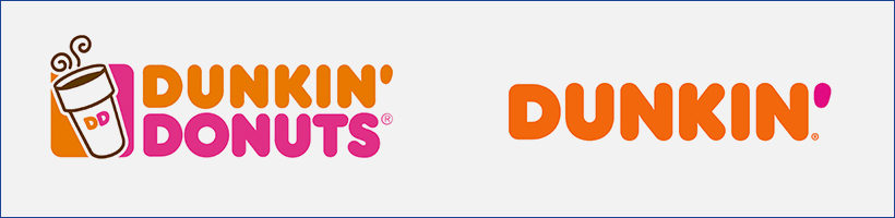
For example, Dunkin’ Donuts dropped the “Donuts” from their name, resulting in a more streamlined logo while maintaining its colour palette.
https://www.dunkindonuts.com/en
The minimalist trend is both classic and contemporary. The key idea is to keep your message and design straightforward. You might use symbols, simple text within a box, or a combination of an icon and text.
https://www.microsoft.com/en-us/
Here are some examples:
Symbols
Not all logos represent a brand or business; some represent movements or organisations. For example, the breast cancer awareness ribbon.

This ribbon can appear as an actual ribbon, a pin, or even a sticker. Its signature pink colour makes it instantly recognisable without words.
The identity of this logo lies in its shape and colour. What elements of your logo do you want to embody your identity?
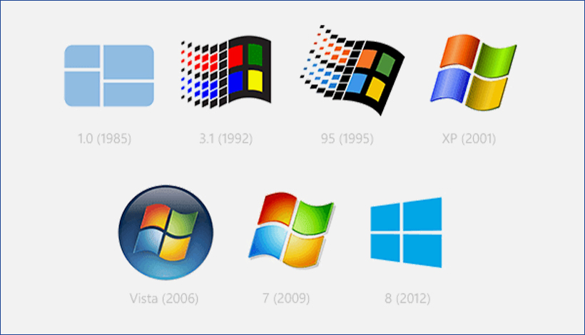
For instance, the Microsoft Windows logo focuses on the window’s shape. Changing or removing the colour still allows customers to recognise the logo.
Such logos are often better suited for larger organisations or businesses. A coffee shop logo featuring just a coffee cup might not stand out; people might see it as just another coffee shop. However, Starbucks uses an icon that isn’t a coffee cup, giving it a stronger identity.
Even though designing a minimalistic logo might be easier, the brainstorming process can be time-consuming.

https://www.supremenewyork.com/
Just Text-in-a-Box
A text-in-a-box logo conveys simplicity, sophistication, and professionalism. This type of design can often be done independently without a designer. The essence of minimalism is not merely reducing elements but simplifying a complex view.
The text can be larger or smaller than the box, with lines that are thick, thin, slanted, or cropped.
It’s all about the fonts and colours. Will you use black and white, or incorporate signature colours? What fonts will you choose?
A prime example is a very simple font with minimal colour, yet it has a significant impact in the fashion industry. This approach often leads to collaborations and stands out in the market.
Of course, you can draw inspiration from this and experiment with other shapes, like circles, ovals, rectangles, or hexagons.
The box can enclose your text or serve as a background. The possibilities are endless. Our goal is to broaden your perspective and inspire you.
Icon and a Text
Combining overlapping shapes, geometry, icons, and text is a trend that has evolved. Today, people prefer clearer boundaries, which makes logos simpler and more adaptable.
Separating the icon and text clearly illustrates both the name and the symbol of your brand. The logo can function with the icon and text together, just the text, or solely the icon.
This adaptability is crucial in the modern media landscape. You want your logo to look great on screens and on any merchandise or product you distribute, both internally and externally.

An icon and text logo is also great for animations.
While combining text and an icon may be a classic approach, placing the text distinctly beside the icon with clear borders and space is a modern trend.
Modernisation isn’t about dramatic changes but refining what already works to better suit contemporary needs.
Trend 2: Pop Of Color
https://www.fedex.com/en-us/home.html
The next trend in modern logo designs is colour. Whether you use bright colours, a simpler colour palette, overlapping colours, or just monochrome, colour can become a defining feature of your logo and brand. The key is to integrate colour thoughtfully while maintaining minimalism.
Your colours should be versatile enough to use in various contexts while still conveying your identity. For instance, Nike’s orange-yellow is instantly recognisable. Even without the logo, you know it’s Nike just by seeing this colour on their store, packaging, or their reusable bags—an eco-friendly option that also promotes your brand.
Similarly, Nike’s logo may appear in white, blue, or a gradient, yet it remains unmistakably Nike.
A simpler logo can be broken down into its elements and still convey your brand’s identity effectively.

Use Bright Colors
Bright colours are excellent for capturing attention. The colour combination is crucial—while bright, it should still convey professionalism.
Take the Chrome logo, for instance. Red, green, and yellow might not seem like the most obvious combination, but they work well together, making the Chrome logo stand out without appearing amateurish. The simplicity of the shapes complements the colours, avoiding confusion that might arise from a more complex design.
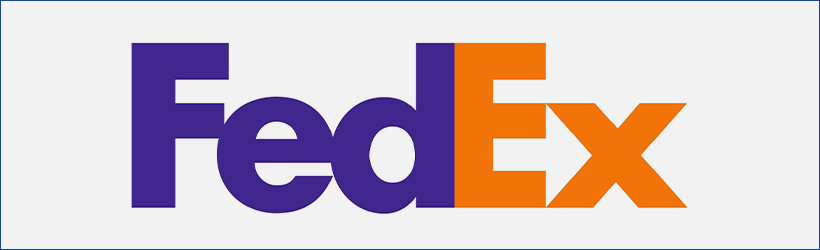
Another example is the FedEx logo. The contrast between the colours at specific points where the letters intersect gives the design a modern edge. The three colours—purple, white, and yellow—work well across various media. Purple can substitute white and act as negative space, or be used to colour other icons in FedEx’s materials.
Understanding how colours work together or consulting with your designer can be very beneficial. A signature colour helps elevate your designs without needing constant adjustments.
Select a Simple Color Palette
With endless colour options, choosing the right one for your brand can be challenging. If your design is complex or if you offer a range of products, a simpler colour palette might be more effective.
For example, a designer might use various shades of yellow to create a cohesive look. This approach is particularly useful if your company offers different product categories, allowing customers to recognise the product easily without needing to read the text.
A signature can come in many forms. Aim for something unique to ensure your business stands out on its own. Once you have a distinctive identity, consistency is key. Even if you evolve your logo over time, it should retain its core identifying features.

Experiment With Overlapping Colors


https://www.mastercard.us/en-us.html
Now that we’ve covered colour combinations and minimalism, let’s explore overlapping colours.
Overlapping colours can add depth and modernity to your logo. Colours like pink, red, and orange work well together due to their similarity, while combinations such as blue and green or blue and pink also create appealing effects.
The key is to limit the number of colours you combine. Designers typically use two or three colours to add flair while maintaining professionalism. Adding more than this can overwhelm viewers, so it’s best to keep it simple.
The Mastercard logo is a great example of how overlapping colours can create a modern look. Although solid colours might seem more contemporary, the overlapping design adds a modern twist. Despite changes over time, Mastercard’s logo remains recognisable.
Monochrome
A monochrome logo is an excellent option for versatility. It’s often wise to start with a coloured logo and then create a monochrome version as well.
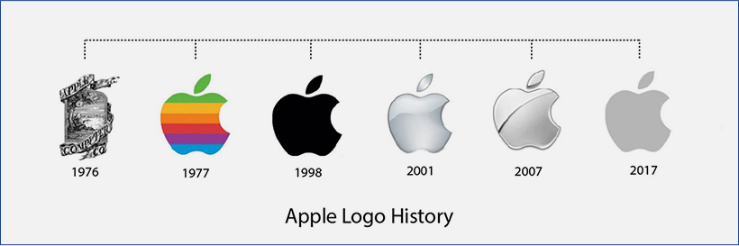
Monochrome works well with more intricate designs because the simplicity of the colour helps the design stand out clearly. For instance, Apple’s logo has consistently used a monochromatic scheme, ensuring it works on all surfaces.
With each logo trend, remember to focus on the core principles that make a great logo.
Trend 3: Color Textures & Patterns
The next step after experimenting with different colours and layers is incorporating textures and patterns. Elevate your logo with colour gradients, textures, and patterns to add depth and interest.
If you’re satisfied with your experiments using solid colours, you might choose to skip this section and explore the next trend. However, if you’re keen to enhance your logo with additional colouring techniques while maintaining a modern and professional look, consider these options:

Gradient
Gradients are a fantastic way to blend colours, adding an extra dimension to your logo. Although flat designs are currently trending, bold gradients can make a strong statement.
Take the Firefox logo, for instance, or the new Instagram logo. Instagram’s logo has evolved over time, but it still retains its essence through its iconic camera shape, despite frequent colour changes. This approach allows Instagram to adapt and refresh its appearance without compromising its brand identity.
The iTunes logo is another example where gradients play a subtle yet effective role. Despite its age, the gradient helps the logo stand out. Tinder’s logo also uses a gradient to reflect fire’s natural colours, demonstrating how bold gradients can enhance a logo’s visual appeal.
Gradients, even in more muted hues, can modernise your logo while maintaining versatility.
Textures
Textures add depth to colours, making your logo more engaging. You can combine textures with gradients to achieve a 3D effect or use textures as solid colours with added shadows.
Consider incorporating images like watercolours, colour effects, or even natural photography. For example, using a crumpled paper effect as a background can add a unique touch to your design.
Textures can make your logo more dynamic and responsive. They work well with solid colours or bold borders, ensuring a modern look without overwhelming the design.

Patterns
Patterns can be an intriguing feature for your logo, either as an overlay or an integral part of the design. Patterns can be embossed or vibrant, adding a distinctive modern edge without appearing tacky.
Fashion brands often use their logos in patterns on clothing, bags, and packaging. Brands like Chanel, Supreme, and LV use their logos to create recognisable and memorable patterns. This technique not only enhances brand visibility but also makes the logo more memorable.
Incorporating a pattern into your logo design can create a unique and memorable visual identity, provided it’s designed thoughtfully and effectively.
Trend 4: Responsive Logo
We’ve now reached the trend of responsive logos, a key movement in modern logo design. Responsive logos are crucial because they adapt seamlessly to various formats and sizes, making them highly effective across different media.
In today’s fast-paced world, where beautiful designs are everywhere—from print and websites to buildings and sidewalks—having a logo that stands out and is instantly recognisable is essential. Modern logos are often simple, vibrant, and immediately clear to ensure they capture attention quickly.
![]()
Why Responsiveness Matters
The modern media landscape includes everything from posters and websites to merchandise and apps. A responsive logo can adapt to different contexts, ensuring it remains effective whether it’s displayed on a billboard or a mobile screen.
Responsive logos usually consist of three main components: the icon, the name, and the colour. In practice, a responsive logo may vary by:
- Stripping away elements: Some versions of the logo might include only the icon, while others might show just the name or a simplified illustration. The core colour remains consistent, maintaining brand recognition.
- Simplification: For various applications, a logo might be simplified to its most basic elements, ensuring it remains clear and effective at different sizes and on different platforms.
The Benefits and Challenges
The advantages of a responsive logo include:
- Versatility: It adapts to various formats and uses, ensuring brand consistency across all media.
- Recognition: Even in simplified forms, the logo retains its core identity through consistent use of colour and key design elements.
- Modern Appeal: A responsive logo reflects a contemporary approach to branding, aligning with the fast-moving digital landscape.
However, creating a responsive logo can be challenging. It requires thoughtful design and often the expertise of a skilled designer. For start-ups or businesses with simpler needs, the investment in a fully responsive logo might be significant.
Evolving Your Logo
If a fully responsive logo is not feasible at the start, you can begin with a basic design and evolve it over time. A logo that evolves as your business grows and as design trends change can become responsive in its own way, adapting to new formats and contexts as needed.
Ultimately, a responsive logo is an investment in ensuring your brand remains effective and recognisable across the myriad of platforms and devices used today.
Trend 5: Use Positive & Negative Space
Positive and negative space in logo design is a trend that leverages the interplay between the foreground and background to create visually compelling and memorable logos. This technique involves using the space around and within a logo to create an additional layer of meaning or imagery.
Understanding Positive and Negative Space
- Positive Space: The main focus of the logo—the part that stands out and is the central element.
- Negative Space: The background or voids around and within the positive space, which can form secondary shapes or images.
Why It Works
This design technique adds a unique and clever twist to a logo, making it stand out while remaining simple and modern. By integrating visual elements into the negative space, you can create a logo that is both functional and imaginative.
Examples and Inspiration
- Creative Examples: Logos that cleverly use positive and negative space include:
- FedEx: The arrow hidden between the “E” and “x” symbolizes speed and precision.
- Baskin-Robbins: The pink part of the “B” and “R” forms the number “31,” representing their variety of flavors.
- Toyota: The overlapping ovals create a subtle “T” shape and symbolize unity and trust.
- Interactive Packaging: Some brands use positive and negative space in their packaging design. For example, a drink bottle might reveal a hidden logo or message as the content is consumed. This interactive element adds an extra layer of engagement and creativity.
- Adventure Example: For a brand named “ADVENTURE,” incorporating a mountain silhouette within the letter “A” could symbolize exploration and excitement.
Benefits
- Uniqueness: This approach helps create a distinctive logo that stands out from the competition.
- Memorability: Clever use of space makes a logo more memorable and engaging.
- Creativity: Showcases the brand’s creative approach, which is particularly effective for industries like design, accessories, or apparel.
Potential Downsides
- Risk of Similarity: There’s a possibility of inadvertently designing something that closely resembles existing logos. Ensure thorough research to avoid unintentional similarities.
- Complexity in Execution: Designing with positive and negative space requires skill and precision. If not done correctly, it might result in a confusing or less effective design.
Trend 6: Typography
Typography as a logo design trend emphasizes the power of text and custom fonts in creating memorable and distinctive brand identities. A well-designed typographic logo can be as impactful as an iconic symbol or graphic element. Here’s a deep dive into the various ways typography can be used to enhance your logo design:

Crop Your Letters
Description: Cropping or cutting away portions of letters gives a modern and sleek appearance to typography-based logos. This trend involves adjusting the letterforms by removing parts or slicing through them, which adds a contemporary touch to the design.
Pros:
- Modern Look: Cropped letters can give a logo a clean, futuristic feel.
- Memorable: Unique cropping techniques make the logo stand out.
- Versatility: Works well with various styles, from minimalist to vibrant.
Cons:
- Risk of Confusion: Over-cropping can make the text hard to read.
- Overuse: Might seem too trendy or dated if not done thoughtfully.
Examples:
- Barbie: Uses cropped typography to create a playful and recognizable brand identity.
FedEx: The subtle arrow formed between the “E” and “x” enhances the brand’s message of speed and precision.
Lettering
Description: Lettering involves customizing the arrangement and design of letters to form a unique typographic logo. This can include changing the layout, integrating illustrations, or manipulating the shapes and spacing of letters.
Pros:
- Creativity: Offers limitless possibilities for customization and creativity.
- Distinctiveness: Can create a highly unique and recognizable brand mark.
- Flexibility: Allows for integration of visual elements and brand identity directly into the typography.
Cons:
- Complexity: May require more time and skill to design and execute effectively.
- Legibility: Overly stylized lettering might affect readability.
Examples:
- Barbie: Uses a custom typeface with playful curves and unique character shapes, enhancing brand personality.
Coca-Cola: Its classic script font is instantly recognizable and has been a key part of its brand identity for decades.

https://barbie.mattel.com/shop
Custom Fonts
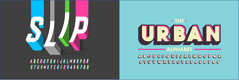
Description: Creating a custom font for your logo involves designing a unique typeface that becomes an integral part of your brand’s identity. Custom fonts allow for consistency across various applications and can enhance brand recognition.
Pros:
- Consistency: Ensures that your brand’s typography is unique and consistently applied.
- Flexibility: Allows for tailored modifications to fit different uses and contexts.
- Brand Identity: Custom fonts can become a signature element of your brand.
Cons:
- Cost: Developing a custom font can be expensive and time-consuming.
- Maintenance: Requires careful management and potential updates over time.
Examples:
- Disney: The distinctive typeface used in the Disney logo is instantly recognizable and synonymous with the brand.
- Urban Alphabet: Custom fonts used in various design projects showcase how unique typefaces can be adapted for different branding needs.
In Practice
Combining Typography Trends:
- Cropping & Lettering: Combine cropped letters with creative lettering to create a modern and eye-catching design.
- Custom Fonts & Lettering: Design a custom font and use lettering techniques to further personalize and enhance your logo.
Design Tips:
- Keep it Readable: Ensure that even with creative modifications, the text remains legible.
- Consistency is Key: Use your custom font consistently across all branding materials.
Test Variations: Experiment with different styles and layouts to find the most effective combination for your brand.
Trend 7: Geometry
In logo design, geometry isn’t just about aesthetics—it’s about creating a clean, memorable, and functional brand mark. Geometric shapes such as squares, circles, and lines provide a structured approach to logo design that can enhance simplicity while adding distinctiveness. Here’s how you can effectively use geometric elements in your logo:

Squares
Description: Squares are versatile shapes in logo design. They can serve as borders, icons, or integral parts of the typography. Squares are known for their stability and balance, making them suitable for brands that want to convey reliability and structure.
Pros:
- Versatility: Squares can be used in multiple ways—borders, icons, or even background elements.
- Simplicity: Provides a clean and structured appearance.
- Responsiveness: Works well in various sizes and formats.
Cons:
- Commonality: Squares can be seen as generic if not used creatively.
- Rigidity: May feel too formal or rigid for some brands.
Examples:
- Domino’s: Uses squares both as part of the icon and as a background element, integrating the shape into the overall design.
- Squarespace: Utilizes a simple square in its logo to emphasize clarity and modernity.
Circles
Description: Circles are highly versatile and can be used as borders, backgrounds, or main icons in a logo. They convey inclusivity, unity, and wholeness. Circles are often used to create a sense of continuity and are excellent for creating visually appealing and easily recognizable logos.
Pros:
- Flexibility: Can be used in various ways—enclosing text, forming icons, or as standalone elements.
- Appeal: The circular shape is inherently pleasing to the eye and can convey a sense of completeness.
- Adaptability: Works well in various applications and sizes.

Cons:
- Overuse: Commonly used, which can lead to a lack of originality if not designed thoughtfully.
- Limited Edges: May not work well for designs that need sharp, angular elements.
Examples:
- Internet Explorer: Utilizes a simple, recognizable circle as part of its logo.
- Chrome: Employs a colorful, overlapping circle design that stands out and is easily identifiable.

Lines
Description: Lines are incredibly versatile and can be used to form shapes, create patterns, or add accents to your design. Lines can vary in thickness and curvature, allowing for a wide range of creative possibilities from minimalist to complex designs.
Pros:
- Simplicity: Straight or curved lines can create elegant and modern designs.
- Flexibility: Can be used to construct various geometric shapes or form intricate line art.
- Variation: Allows for different effects with varying thicknesses and styles.
Cons:
- Complexity: Overuse of lines or intricate designs can become cluttered or hard to interpret.
- Attention to Detail: Requires careful attention to ensure that lines do not overwhelm or complicate the design.
Examples:
- Mastercard: Uses overlapping lines to create a distinctive and memorable logo.
- Line: A messaging app that uses simple line art to form its recognizable logo.
Design Tips
- Combine Shapes Thoughtfully: Experiment with combining different geometric shapes to create a unique logo that stands out while remaining simple and effective.
- Play with Color and Texture: Use colors, gradients, and textures to add depth to geometric shapes, making your logo more dynamic and engaging.
- Consider Responsiveness: Ensure that your geometric design maintains its clarity and impact across different sizes and applications.
- Balance Simplicity and Complexity: While geometric shapes are often simple, combining the
Trend 8: Vintage
Vintage design in modern logos is a fascinating trend, blending nostalgia with contemporary branding. By incorporating vintage elements, companies can create a distinctive identity that feels both timeless and relevant. Here’s a breakdown of how vintage designs work and how to implement them effectively:
![]()
https://www.jackdaniels.com/en-us
![]()
https://www.stellaartois.com/en_us/home.html
Description: These logos are characterized by intricate details, including numerous lines, shapes, icons, and text. They often have a rustic, handcrafted appearance that evokes a sense of history and tradition.
Pros:
- Rich Detail: Provides a complex and visually engaging logo.
- Storytelling: Offers a nostalgic feel that can enhance brand storytelling and convey a sense of heritage.
- Distinctiveness: The detailed nature can make your logo stand out in a crowded market.
Cons:
- Complexity: Can become cluttered if not designed carefully.
- Scalability: Might lose clarity when scaled down, making it less effective in smaller sizes or digital formats.
- Modern Appeal: May not always align with a brand’s modern or minimalist approach.
Examples:
- Jack Daniel’s: Utilizes a detailed, vintage-inspired design that reflects its long-standing tradition in the whiskey industry.
- Stella Artois: Features ornate detailing that evokes a classic European beer heritage.
Design Tips:
- Highlight Key Elements: Focus on the most important aspects of your design to avoid overwhelming the viewer.
- Use High-Quality Graphics: Ensure that the intricate details are clear and crisp, even at smaller sizes.
Maintain Balance: Combine detailed elements with clean spaces to keep the design readable and visually appealing.
2. Clean, Brightly Colored Vintage Logos
Description: These logos feature a vintage aesthetic with clean lines and vibrant colors. They often draw on the design trends of the past while incorporating modern simplicity.
Pros:
- Fresh Look: Combines nostalgic elements with a contemporary color palette, appealing to modern audiences.
- Versatility: Bright colors and clean designs work well across various media and sizes.
- Enhanced Storytelling: Colors and simplicity can effectively communicate your brand’s message and personality.
Cons:
- Potential for Over-Simplification: Striking a balance between vintage charm and modern simplicity can be challenging.
- Brand Identity: If not executed well, it might not capture the intended vintage feel, making it harder to stand out.
Examples:
- Pepsi: Although modern, its use of bright colors and clean lines echoes vintage branding elements.
- Coca-Cola: The classic script and retro style have been modernized to maintain a nostalgic yet contemporary appeal.
Design Tips:
- Choose Colors Wisely: Use bright colors that complement each other and align with your brand’s identity.
- Emphasize Clarity: Ensure that your design remains clear and effective at different sizes and in various applications.
- Incorporate Modern Elements: Blend vintage aspects with contemporary design trends to appeal to a wide audience.
Implementation Strategies
- Research Historical Designs: Look at historical logos and design elements to understand how vintage aesthetics were originally used. This can provide inspiration and guide your design choices.
- Blend with Modern Trends: Combine vintage elements with modern design principles to create a logo that feels both timeless and current. This might include using clean lines, minimal color palettes, or updated typography.
- Focus on Brand Storytelling: Use the vintage design to enhance your brand’s story. Whether through intricate detailing or bold, bright colors, ensure that your logo reflects your brand’s heritage and values.
- Test Across Media: Make sure your vintage logo works well across various media, from digital screens to print. Test the design at different sizes to ensure it maintains its impact and readability.
Trend 9: Drawn Logo
Hand-drawn logos have a unique charm that sets them apart from more standardized designs. They bring a personal, artisanal touch to branding, offering a distinctive, bespoke quality that can be incredibly impactful. Here’s a closer look at the hand-drawn logo trend, its benefits, and how to leverage it effectively:
1. Why Choose a Hand-Drawn Logo?
Personal Touch: Hand-drawn logos convey a sense of authenticity and personal involvement. They can make a brand feel more approachable and relatable.
Unique Appeal: Each hand-drawn logo is one-of-a-kind. Unlike digital designs, which can sometimes feel generic, a hand-drawn logo ensures that your brand stands out with a distinctive look.
Versatility: Hand-drawn designs can range from simple line art to elaborate illustrations. They can be adapted to fit various styles, from vintage to modern.
Emotional Connection: Hand-drawn logos often evoke a nostalgic or artisanal vibe, which can create a stronger emotional connection with your audience.
2. Types of Hand-Drawn Logos
Simple Line Art: Minimalist and elegant, simple line art logos focus on clean, unadorned lines to create a sleek and professional look. They can evoke a sense of sophistication and modernity.
Detailed Illustrations: More intricate hand-drawn logos feature detailed artwork and elaborate designs. These are great for brands that want to convey creativity and complexity.
Playful Designs: For brands targeting a younger audience or those in creative industries, playful, whimsical hand-drawn logos can add a fun, approachable element.
Rustic/Vintage Styles: Hand-drawn logos with a rustic or vintage feel can evoke a sense of tradition and reliability. They are often used by artisanal brands, breweries, or businesses that want to highlight their heritage.
3. Advantages of Hand-Drawn Logos
Authenticity: A hand-drawn logo feels more authentic and personal, which can build trust with your audience.
Originality: Unlike many digital designs, hand-drawn logos are inherently unique. They are less likely to be replicated or confused with other logos.
Emotional Appeal: The personal touch of a hand-drawn logo can resonate emotionally with consumers, making the brand more memorable.
4. Potential Challenges
Quality and Consistency: The quality of a hand-drawn logo heavily depends on the skill of the designer. Inconsistent lines or poorly executed details can detract from the brand’s professional image.
Scalability: Detailed hand-drawn logos might not scale well across different sizes or mediums. Ensuring that the design remains effective and legible in various applications is crucial.
Production Time: Hand-drawn logos can take longer to create compared to digital designs. This might impact project timelines and costs.
5. Designing Your Hand-Drawn Logo
Find the Right Designer: Work with a skilled designer who specializes in hand-drawn artwork. Review their portfolio to ensure their style aligns with your vision.
Define Your Style: Decide on the style of hand-drawn logo that fits your brand. Whether it’s simple line art or detailed illustrations, make sure it aligns with your brand’s identity and message.
Incorporate Modern Elements: Even with a hand-drawn approach, you can integrate modern design elements to ensure the logo remains relevant and versatile.
Test for Versatility: Ensure your hand-drawn logo works well in various sizes and formats. It should be effective in both color and black-and-white, and on different backgrounds.
6. Applications of Hand-Drawn Logos
- Branding Materials: Use your hand-drawn logo on business cards, letterheads, and packaging to reinforce your brand’s unique identity.
- Merchandise: Hand-drawn logos can be particularly effective on merchandise like apparel, mugs, and phone cases. They add a personal touch that can enhance brand loyalty.
- Digital Media: Ensure your hand-drawn logo looks great on digital platforms, including websites, social media, and mobile apps.
Start Designing Your Own Modern Logo
You’ve explored various modern logo trends, from minimalistic and typography-focused designs to geometric and hand-drawn styles. Now it’s time to take the next step and start crafting a logo that truly represents your brand.
Here’s how to get started:
- Gather Inspiration: Reflect on the trends we’ve discussed—minimalism, typography, geometry, hand-drawn styles, and more. Identify which elements resonate most with your brand’s identity and values.
- Define Your Brand Identity: Consider what your brand stands for, your target audience, and the message you want to convey. Your logo should encapsulate this essence while standing out in a crowded market.
- Choose Your Style: Based on your brand identity, decide on the style that best suits your needs. Whether you go for a sleek, minimalistic design or a vibrant, hand-drawn look, make sure it aligns with your brand’s personality.
- Sketch and Experiment: Start sketching out ideas, experimenting with different styles and elements. Don’t be afraid to play with colors, shapes, and textures. This is your chance to explore and refine your vision.
- Work with a Designer: If you’re not a designer yourself, consider collaborating with a professional. A skilled designer can bring your ideas to life and ensure that your logo is both visually appealing and functional.
- Test Your Design: Once you have a draft, test it across various applications—business cards, websites, merchandise, and social media profiles. Ensure it maintains its impact and legibility in different sizes and formats.
- Finalize and Apply: After refining your design, finalize it and start integrating it into your branding materials. Apply your logo to custom phone cases, promotional items, and other materials to boost brand visibility.
Ready to bring your logo to life?
If you’re inspired and excited to get started, or if you already have a design that you’d like to apply to custom merchandise, contact us today for pricing and more information.
Start Here to explore how your modern logo can enhance your brand and make a lasting impression.

Bhushan spent the last 15+ years building businesses and learning what really matters to customers. At Custom Logo Cases, we help brands turn everyday tech accessories into high-quality, on-brand marketing tools.


It's the MOST wonderful time of the year at Custom Logo Cases! We're hard at work preparing custom sleeves and cases for the upcoming 2026-2027 school year. Beat the summer rush and order now for delivery before school starts! 📚✏📗🧳🚌🏫
#backtoschool #schoollife #SchoolYearReady #SchoolTechnology #laptopbag #chromebookbag #macbookcase ... See MoreSee Less
Call Now
We just donated to DonorsChoose fully funding multiple requests ahead of the FY 25-26 school year close. Countless schools need assistance and you can help too! Check out DonorsChoose today and see how you can make a teachers job easier and spark magic in the classroom. 🫶🙏 ... See MoreSee Less
DonorsChoose: Support a classroom. Build a future.
www.donorschoose.org
DonorsChoose connects teachers in high-need communities with donors who want to help.🚨 Attention K-12 Tech Directors & Admins! 🚨
Secure your 2026-2027 deployment before the summer rush.
We just launched our new, ultra-rugged 360° Protection Case built specifically for K-12 Chromebooks and the Apple Neo.
Why This Case?
Drop-Proof: Military-grade 360-degree shock absorption.
Student-Proof: Reinforced corners and pick-resistant port covers.
Versatile: Full rotation for tablet and laptop modes.
⏱️ Act Fast for August Delivery ‼️‼️
Supply chains tighten drastically by June. Order by May 31st to guarantee delivery and tagging before students return this August 2026. ... See MoreSee Less
Call Now