


Logo is a big part of your brand’s identity. You don’t want to skimp out on this. Designing the perfect modern logo can be tricky. Not because it’s hard, but because the option is endless. It all comes down to how you want to be perceived.
A designer can only get you so far. You must understand your business’s essentials and pair it with a visual that best represents who you are.
Modern logos are a combination of many things. It can be something simple, just a few strokes of lines, or even complicated, hand-drawn, and full-colored with different gradients. It’s true that logos evolve. But the classics always stick.
The most important part is your logo identifies who or what your business is to your customers and stakeholders.
This article will help you figure out the things you need to have in your logo to make it memorable and a few inspirations to help you and your designer get started.
What Can Make Your Modern Logo Stand Out
A modern logo does not mean that you abandon all classic styles. It just means that you are ready to compete in the modern market. You want a logo that is memorable, can easily tell your story, designed well, and looks professional
The best kind of logo can adapt and evolve following the trend and time. But at its very core, it’s solid and identifiable. If you are ready to design your logo, it’s all about communicating with your designer. Make sure that you’re both clear on the goal and can fix any hiccups along the way.
If you’re still struggling to figure out which points to prioritize, read through some points that will truly help your logo stand out for the rest and from the test of time.
Memorable To All
A logo is not the same as a brand, but remember that your logo is the visual representation of your brand. Understanding the entirety of your brand may not always be possible to do with just the logo. But you want the people to see your logo and remember it, possibly be interested in learning more about your brand.
There are logos that put a lot of their identity to their color. Even though the image or the words may not be too clear, the color will demonstrate its identity. Such as Starbucks and their identity green color.
Other logos will prioritize their shape and not much on the color. So they can adapt to any background or design. Such as Nike. This proves to be great because they produce clothing and accessories. So their logo stands out on whatever product they have.
Being memorable is not only important to your brand identity. It is also important for your sales. How can people make a repurchase when they don’t even know who you are? You don’t want to be just another “coffee shop”, or just another “t-shirt”.
People tend to memorize things they understand. Things they connect with. So keep that in mind while you think of your design.
Successfully Tell Your Story
They say that a picture is worth a thousand words and you can do so by capturing your company’s value and essence.
The logo will reflect what your company can do and the audience you’re trying to reach. It will be hard to sell simplicity if your logo is complicated. Or maybe you’re an eco-friendly startup, you can’t use the same face as a tech company.
Are you friendly? Serious? Professional? Anything is translatable through your logo. Recognize where you’re coming from and present that.
Tell your story. Successfully.
Exceptional Design
Now that you’re all set on telling your story, it’s time to design it. But how? What makes an “exceptional” design?
The best designer will not produce the best design. Because in fact, there is no “best” designer. Each designer will speak to you differently, and it’s not about getting the best, but more towards getting the perfect one for you.
You want to ask for uniqueness. You want your logo to be one of a kind. Because it’s yours.
Next, you want it to be simple. Because your logo will be everywhere. Think of it as a signature. A signature that your brand will leave.
Finally, you want to think of versatility. Can it be simplified? How does it do in black and white? Does it have a distinct silhouette? How about printed? Will the color show on leather? Does it look good on a website or the app store?
Lots to think about.
Professional For Your Brand
Now that you’re all set and ready to get started on your attractive, inspiring, and persuasive logo, you think you’re all set. Well, not entirely.
You need to make sure that your logo looks professional. Since your logo will be the face of your brand and your business. You want people to take you seriously and make sure that it’s not amateur.
Going with a poorly executed logo will erase all your previous efforts. You may be memorable, but it will not be the message you wanted people to get. And it can alter your story.
Whatever style or color you choose, make sure that it really reflects who you are and what you stand for. Never ever skimp out on your logo.
I guess that’s it. You’re ready to explore all the different modern logo designs.
Trend 1: Minimalistic
Minimalistic is placed as number one, but you could say that it’s the ultimate modern logo. It’s sleek, clean, and easy to read. A thing we love in modern times. Everything moves so fast and people expect big contents in little packages.

Having a simple logo will allow you to convey your story professionally. Older brands redesign their logo to make it simpler without losing their identity.
Dunkin donuts dropped the “donuts”, therefore making their logo simple without losing its color palette.
https://www.dunkindonuts.com/en
Microsoft Windows has made its logo simpler over time. They dropped their color without losing their identity.
https://www.microsoft.com/en-us/
The minimalist trend is classic and yet still modern. There are endless options and examples, but the key idea is to keep your word and your design simple. You can do this by just having symbols for your logo, trying a simple text in a box, or having an icon and a text next to it.

Check out a few examples below.
Symbols
Not all logos represent a brand or a business. Sometimes it can represent a movement or an organization. This is an example of a breast cancer awareness ribbon.
When you use it, it can be as the actual ribbon, a pin, or even as a sticker. You don’t even need words to recognize its signature pink color.
The minimalist nature of the logo allows it to be versatile. You can wear it in many forms, but people will instantly know your purpose.
The identity of this logo is in its shape and color, and that’s what you need to keep in mind. What elements of your logo do you want to be your identity?

If we look again at the Microsoft Windows logo, they placed their identity in the window’s shape. So changing or removing the color will allow customers to still recognize the logo.
These kinds of logos are better for larger organizations or businesses. It might be difficult to stand out when you have a cup of coffee as your coffee shop logo. People will simply look at you as coffee, there is no “unique” factor. But if you look at Starbucks, which uses an icon, that is not a coffee. It will give you a stronger identity.
Even though the design process might be easier when you decide on a minimalistic logo, the brainstorming process will certainly take longer.
https://www.supremenewyork.com/
Just Text-in-a-Box
If you decide on a text in a box logo. It will show that you are simple, sophisticated, and yet still professional. It is very possible for you to do this on your own, without a designer. But the key to minimalism is not to reduce something but to simplify a complicated view.
So the text can be bigger than the box. Or smaller than the box. The lines could be thick, or thin, or slanted, or maybe a little cropped.
After all, it comes down to the fonts and the colors. Will it be black and white, or do you want to place your signature elements in your color? What fonts will you use?
Looking at the example, it’s barely a logo. A very simple font, with a very simple color, and yet its impact in the fashion industry is tremendous. It collaborates with other brands and stands out.
Of course, then you can simply take this for your inspiration and possibly use other shapes. You can use circles, ovals, rectangles, hexagons, and many more.
You can use the box to enclose your lettering or use it as a background. The option is endless. We are simply here to broaden your mind and inspire you.
Icon and a Text
Overlapping shapes, geometry, icon, and text is an older trend. Now people want clearer boundaries. The reason for this is so that the logos are simpler and more adaptable.
The separation between the icon and the text will clearly illustrate the name of your brand and the logo of your brand. The logo can work with the icon and the text, just the text, or simply just the icon.

This goes back to the adaptability nature of a modern logo. This is important because now we have so much media. You want your logo to look great on-screen, as well as any merchandise or product you distribute internally or externally.
Having an icon and text responsive logo is also great to do animations with.
A text and an icon may be a classic trend. But placing a text distinctly besides a logo with clear borders and space between them parallel to each other is the modern trend.
Modernization is nothing significant. It’s simply taking something that already works and shaping it to be better suited for modern times.
Trend 2: Pop Of Color
https://www.fedex.com/en-us/home.html
The next trend of modern logo designs is color. You can use bright colors or a simpler color pallet, you can do overlapping colors or simply monochrome.
Your colors can be the identity of your logo and your brand. You just have to be smart about it. If you combine it with what you’ve read and minimalism.

You still want your colors to be versatile enough to use them in other ways and still give off your identity. Like Nike’s orange-yellow. Whenever you see it, you can recognize that it’s Nike, even if you can’t see the logo. You know that store is Nike, or the box and even their plastic bag. Note, convert to reusable bags and save the environment while promoting your logo.
Meanwhile, the Nike logo can be white, blue, or a gradient, and you still recognize it like Nike.
A simpler logo can be broken apart and still define your brand with each element.
Check out the application of different colors to real logos and how they can best complement your brand’s visual representation.
Use Bright Colors
When you use a bright color, it will capture viewers’ attention. The most important thing is the color combination, although bright, still exudes professionalism.
Let’s look at the chrome logo. Red, green, and yellow may not be the best color combination, but somehow they work well together. They make the chrome logo stand out without looking like an amateur logo.
The way it’s placed also complements the overall logo. The simplicity of the shapes allows the color to give it something more. If the chrome logo was a tree with colorful leaves can be confusing.
Another example we can look at is the FedEx logo. The difference between the colors is placed at a point where the letters stick together. This gives the words something else and pushes the simple letter into becoming a modern logo.
The three colors, purple, white, and yellow work together over any media. The purple can replace the white and work as negative space. Or it works to color any other icon Fedex might have in their documents.
Studying how colors work together or consulting with your designer will help you vastly.
Having identity color helps elevate your designs without having to rethink them each time.
Select a Simple Color Palette
Colors, like designs, are limitless. There is no shortage of inspiration. The hardest is to choose one just for you.
If you are opting for a more complicated design, you might benefit from a simpler color palette. This also works if you have a lot of different products.
Let’s look at the example picture and explore it. The designer took various shades of yellow and played with them.
Using color palettes works effectively if your company offers different categories of products.
This way, your customers can easily recognize the product without having to read the words.
A signature can come in many forms. You just need to choose one that is unique. You don’t want to be a copycat because then the entire world will know that your business doesn’t stand on its own.
Once you have a unique identity. It’s time to be consistent. Even if you want to evolve your logo over time. It still needs to have its core identifying features.
Experiment With Overlapping Colors
Now that we’ve discussed how to combine colors and yet keep them minimalistic and versatile, we can experiment with overlapping colors.
Above, we have a palette of overlapping colors. As we can see colors like pink, red, and orange work well together because they are similar colors. But it turns out that colors like blue and green, and blue and pink still work well together.

The key to having a combined color look modern is to limit the number of colors you want to combine. Designers usually experiment with two or three to give it a flare and yet maintain their professionalism.
Of course, you could always try to combine more like four or five, but don’t overdo it as it can overwhelm any potential customer.

https://www.mastercard.us/en-us.html
Let’s take a look at the master card logo. You would think that having solid colors will be more modern than overlays. But the image clearly showcases that the overlapping makes the logo design a lot more modern than the previous one.
With this example, you can see that the technique where you combine colors is just as important as your color selection. Mastercard is a very successful company. Their logo, even though it has been refurbished, still maintains the master card’s identity.
Hopefully, this can inspire you to select a timeless design for your own logo.
Monochrome
A monochrome logo is a great option for a responsive alternative.
It might be a good idea to start with a colored logo and then have the monochrome option in case you need it. A complete design set.
Monochrome works well with a more complicated design because the simpler color allows the design to stand out. Therefore, still conveying a clear message to your audience.

An example we have is the apple logo. Apple has consistently kept its monochromatic logo. But it works on all surfaces.
With each logo trend, you need to refer back to the core of what makes a great logo.
Trend 3: Color Textures & Patterns
The next step after experimenting with different colors and layers is textures and patterns. Your logo can be elevated with color gradients, color textures, and even color patterns.
Now that you’ve seen the different combinations of colors and how they work together, it’s an inspiring idea to look more into it. If you are happy with your solid color experiments, you can skip this section and go to the next trend.
But if you’re excited to find out how to do more coloring while still maintaining your logo’s modern aspect and professionalism, check out a couple of examples here!
Gradient
A great way to combine different colors is through gradients. It gives your logo an extra layer even though the trend is flat lay right now.
The new trend for gradient colors is combining bolder colors together to make a bold statement.
An outstanding example is the Firefox logo as well as the new Instagram logo. You can see the evolving nature of the Instagram logo. Their signature is the camera shape. Even though that also changes but it’s still Instagram.
Instagram didn’t put its identity in its colors. So constantly changing it over time allows Instagram to bloom without diminishing its logo integrity.
Another prominent example of gradient logos is the iTunes logo. Notice that the iTunes logo is pretty old, and the gradient is a minor part of the logo even though it still stands out.
The tinder logo is also a great example if you want to play around with gradients. While the Instagram logo adopts more colors and combines them, the tinder logo gradients fire colors. This works great because fire in its true form appears as a gradient.
A bold gradient. Even though tinder uses a redder hue, it can work just as well with a bluer hue.
This proves that color gradients will not limit your logo’s versatility and will give it a modern twist.
Textures
Another thing you can do with colors gives them texture. The image we have is a very simple yet versatile example of what you can do with color textures. You can combine it with a color gradient to achieve a real 3D look for your logo.
You can also just have the color texture as solid colors and maybe add shadows to give it that extra 3D look. You can use it as the background of your logo, or the colors of your text or icon.
You can use images, such as watercolors, color effects, or even natural photography. Having a crumpled paper as a colored background is another great use of textures.
Color textures work well as a responsive logo since the colors can be simplified, or you can remove the textures.

The thing about color textures that makes it modern is to combine them with solid colors or bold borders. The signature of a modern design is boldness and not just letting all the colors mush together without purpose.
Patterns
A pattern is an interesting feature for a logo. A pattern can be on top of or a part of the logo itself.
The pattern can also be embossed, or sort of an effect. On the other hand, it can be bold and colorful. A pattern gives your logo that modern edge by being a unique feature of your logo without being tacky.
Another way to look at it is to have one logo and print it as a pattern. A lot of fashion brands do this. Chanel, supreme, and even LV. They print their singular logo and create patterns on the clothes, their bags, and even their wrapping paper.
Another addition that patterns will provide for your logo is that, if designed properly, a pattern will be more memorable.
Trend 4: Responsive Logo
Now we have arrived at the responsive logo trend. Responsive logos are a big movement in the world of modern logos. The reason responsive logos goes hand in hand with modern logos is that they work very well with each other.
Modern logos need to be able to stand out. Nowadays, there are beautiful designs everywhere. From print to websites, and even buildings and sidewalks a modern logo needs to be memorable.
In modern times, everything is so fast-paced. There is almost no time to stop and appreciate the view. That’s why modern logos are usually simple, bright, and obvious in every way.
Responsiveness is important because of all the different media we have at this modern time. Starting from posters, wall feeds, news, images, merchandise, calendar, buildings and so much more.
If we look at the example above, we can see that each logo is made of three main components. The icon, the name, and the color.
It simplifies the logo. Some logos strip away their name, while others strip away their illustration, icon, or pattern. But each of them still has its signature color, and that is why we spent two sections talking about color.
Not all logos are responsive. Some are already made very simple, while others cannot afford to lose any aspect of their logo.
The benefits of having a responsive logo certainly outweigh the downside. You can anticipate and do simply everything with a responsive logo. But creating it takes a lot of work. You need a designer who is truly inspired.
This is not something every start-up business can afford. Especially if you already know that you’re doing something simple, and doesn’t need the responsive feature. However, with different gadgets where we can easily change from using a phone to a laptop or even a tablet, having a responsive logo that can quickly show your logo no matter how big or small the screen is, will give you an advantage.
Of course, you can always start with a logo and evolve it to your needs. So that’s something to keep in mind. A responsive logo can be evolved, and a logo that evolves is responsive in its own way.
Trend 5: Use Positive & Negative Space
Positive and negative space logos are fairly simple. Here are a couple of examples that can hopefully inspire your venture in logo making.
You can see that each letter, which usually has a hole, now has a negative space in the shape of a wrench and thumb. We can also see that the wrench and the thumb go out to form a positive space.
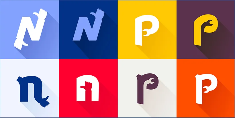
This is the most basic form. You can experiment with other shapes. Like a mountain inside an A if your business sells adventure and is called ADVENTURE. Very simple yet impressive.
The reason that this works, is because the negative and positive spaces give your logo a unique twist while remaining simple, modern, and professional.
Some creative browsing has also shown that negative and positive spaces can be used interactively with packaging. For example, the colors in your drinks will show different logos once you’ve drunk the content away.
Keeping that in mind, negative and positive spaces can definitely help you with your packaging and overall design profile, not just your logo. Feel free to look for more examples and be inspired.
As was mentioned, the biggest benefit this trend brings you is uniqueness and memorability. It also gives you a chance to present your brand’s creativity. If you are in the design, or accessories, or apparel field. It promises so much potential to your customers.
The downside, of course, is becoming a copy of another logo. If you are not confident, you can follow the other trend and it will not be any less inspiring.
Trend 6: Typography
This is another field of a logo on its own. Just like the colors, some logo places their identity in the words. The naming, as well as the typography. With words, you can do almost anything.
You can crop your letters and even custom fonts. A great example is Disney. “Disney” is a great logo all on its own. With its identity font “D”.
You can complement the letters with colors, and different methods of coloring. You can take apart the letter and build an icon. They might seem simple, but they’re quite the challenge for designers.
Crop Your Letters
Cropping or cutting away at your letters does give your typography logo a more modernized look. But if you give it too much, it may look too futuristic unless that’s how you initially intended it to be.
Cropping a letter may be a good idea for a business that wants a logo. But if you’re a designer, you can take it one step further and make the whole font for other people to use.
The cropped logo trend is a very modern design. You can play with thinner fonts and thicker fonts. You can use monochrome, solid bright colors, and even gradients.
The content of your letters should not overwhelm the cutout effects you were trying to achieve by cropping your letter. The simple name of your business can be elevated to a one-of-a-kind memorable logo if only you crop it in the correct points.
Lettering
Next up we have lettering. Lettering is changing the way your letters are presented. The simpler version would be to arrange them in a curve, or a square, or vertically. All of which may not be good enough for some brands. But it does make a very interesting minimalistic monochrome logo.
https://barbie.mattel.com/shop
Lettering is an unlimited version of cropping your letters. Instead of just cropping away bits of it, you can completely redesign for a whole new font. You can also add illustrations and icons. You can even play with positive and negative spaces in your new font set.
Lettering is a great trend to play with because you remove the icon or illustration focus of the logo.
You need a truly creatively put-together letter, in terms of its shape, positioning, and even colors to have a stand-out logo. With lettering, you can overlap the letters and even remove letters to make a statement with your logo.
The image above is a good example. The simple color palette and unique shape makes it stands out.
You can play with darker colors and thicker fonts. It really depends on the story you’re trying to convey.
Custom Fonts
The last trend is something we’ve been talking about all along. Custom fonts. When you’re doing lettering, it’s a great option to go all the way and create custom fonts.
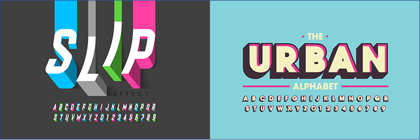
Custom fonts are beneficial because it will be easier for you to reuse your font anytime you need to. You can always edit your main logo and give it extra flair, while you store the original custom fonts for other aspects of your design.
You can use it in your brochure, your tagline, your website, and so much more.
Having a complete set of custom fonts can also help your logo evolve. You already know what characteristics each letter has, and it will be easier to modify. Doing custom fonts doesn’t need much work, but the result is plenty.
Let’s take a look at the examples above. Both of which use colors as a design element. When you’ve already created a whole set of fonts, you can easily edit the colors as you see fit.
In the Urban Alphabet, you can see that the main set of fonts can be stripped off of its feature and be made into a simpler yet complementary font.
Even though a modern logo is identified by its simpler nature, designing a complete look will never hurt. You can easily strip away and showcase the beauty within.
Trend 7: Geometry
Not every shape and line in a logo is an illustration or icon. Geometry can give a lot to a logo. This includes circles, squares, and regular lines. The geometry in a logo is often used as a border to enclose texts or a part of the logo. Simple shapes can create a clean, yet memorable icon.
Construction companies use quirky lines to illustrate a house or a building. You can also do similar things if you sell pies.
The purpose of geometry is to accentuate your simpler logo while still maintaining its simplicity. You can also go the extra mile and make your modern logo look vintage.
Geometry is less than an illustration but definitely more than just strokes. You can benefit from a cleverly designed geometry logo. If you read on, you can check out some examples to inspire you.
Squares
The first shape to discuss is the square. It was actually briefly discussed in a previous trend which is “text in a box”. The square in a logo can be more than a text in a box.
The shape can act as a border, but it can also be a part of the logo, a part of the typography, or maybe the icon. In this example, you can see the Dominos logo.
The square in the Dominos logo is used as a border as well as the icon, and as a part of the typography. It is also responsive.
So all in all a great example. But you are free to modify and use it however you please. There is no right or wrong, as long as you follow the important points that we’ve gone through throughout this article.
Circles
Another common shape you can use in your logo is the circle. The shape is extremely versatile in a logo. You might even say that the core of a logo is a circle. The circle works just like the square shape, where it can be a border, an icon, or even the logo itself.
Above, you’ll see various examples of circle logos. A couple to name is Line, Internet Explorer, Xbox, Chrome, and more. All of which is a logo on its own. You don’t even need the text or the actual name to identify it.
Another thing you can do with a circle is to enclose your vintage logo. Vintage styles are still modern, especially if it’s responsive.
A circle can also be used as art to form different kinds of icons beside your text. If you make it unique enough, the icon can stand on its own and be its own logo in certain settings.
A circle is a very common element, but the things you can do with it are only limited by your imagination. The tricky part is deciding what to do with the shape.
Don’t forget the use of colors. You can have irregular circles overlapping each other. Or creating a gradient. You can also use negative space in your circle. We could make a list, but the list wouldn’t end.
Lines
Lines can be put together to form all kinds of geometrical shapes. It can even be formed into non-geometrical shapes.
Above is an example of lines in different types of logos. You can make a circle with just straight lines if positioned correctly.
You can also do line art to create all kinds of icons. The lines can be used to highlight or border your text. It can be curved, bent, or even constructed like a twirl. You can also play with the thickness of your lines. It can even start out thin and go thicker. A little bit like water droplets.
You can incorporate different colors with your lines and create different feelings. The thing that makes lines a hit in modern logo design is their simplicity. Creating line art without overlapping looks very cool and sleek.
The lines can also act as accents if you’re doing a vintage logo or aiming for a fuller illustration.
A clean straight line will give your design a modern edge. It’s all about how you want to incorporate it into your logo.
Trend 8: Vintage
Did you know that a vintage design is actually a modern logo? A lot of startups get ahead and are memorable because of their vintage logo.
It works because the company is new, and yet they adopt an older face. It’s something about opposites that works to attract people.
Vintage logos generally go into two categories. The first one is heavily illustrated and has a lot of lines, shapes, icons, and words in it. This works because it gives the brand a rustic feeling. Of course, if you decide to go with this, you still need a feature to stand out from the crowd.
https://www.jackdaniels.com/en-us

https://www.stellaartois.com/en_us/home.html
Maybe it’s your icon, or maybe it’s your name. Either way, you want something to make sense from the chaos.
The other type of vintage logo is a clean brightly colored identity. This is especially interesting because bright colors were actually a trend back when vintage logos were simply called “logo”.
You can find both colorful and monochromatic vintage logos associated with the modern brands of today. The upside to using this logo is that it tells your story better. It adds to your storytelling and gives your customers a certain impression of your brand.
The downside of this is being true to your identity. When you use too many elements in your logo, you might lose yourself in the mix. Different from a simpler logo, where you have nothing if you don’t stand out.
Trend 9: Drawn Logo
There’s a lot of examples of hand-drawn logos. You can even look for more and be truly inspired. Going with a hand-drawn logo means that you trust your designer, or give a personal touch to your brand.
When you’re doing hand-drawn logos, you open yourself to possibilities. Doing a simple line logo may give it a rustic feeling and become a vintage logo. You can also do color blending, overlays, and gradient the old-school way. With paint or color pencil.
Hand-drawn logos can be simple line art and very complicated graphic illustration. Modern logos adopt hand drawing because it is unique. You can choose a simple Christmas tree for your holiday logo but if you have it hand-drawn, well it’s another story. The tree will look unique, one of a kind. Child-like, playful, and yet somehow very aesthetically pleasing and professional.
The only downside to this kind of logo is the quality of your designer. Each designer has their own style. But the logos we discussed could be designed by yourself if you’re feeling confident. Without the basics of an artist, it would be extremely difficult for you to complete a hand-drawn logo on your own.
Start Designing Your Own Modern Logo
There you go. All the different modern logo designs you can try out on your own. From minimalistic, typography, geometry, hand-drawn, and much more. We’ve briefly discussed how your logo is the face of your brand. But remember that branding is more than just logo design and it’s very important for your business.
Are you feeling inspired? If you are, it’s time to get started on your logo. Once you’re ready with your logo, you can start sticking to everything you can to increase brand awareness. You can even stick logos on phone cases because then people will carry them all the time.
And if you already have a logo, you can immediately start printing it on all kinds of cases. It’s usable, functional, and has a purpose.
Apply your modern logo designs on custom logo cases for a special branding opportunity.
Have a concept phone case? Request your pricing today. Contact us for more information. Start Here

Bhushan spent the last 15+ years building businesses and learning what really matters to customers. At Custom Logo Cases, we help brands turn everyday tech accessories into high-quality, on-brand marketing tools.


We just donated to DonorsChoose fully funding multiple requests ahead of the FY 25-26 school year close. Countless schools need assistance and you can help too! Check out DonorsChoose today and see how you can make a teachers job easier and spark magic in the classroom. 🫶🙏 ... See MoreSee Less
DonorsChoose: Support a classroom. Build a future.
www.donorschoose.org
DonorsChoose connects teachers in high-need communities with donors who want to help.🚨 Attention K-12 Tech Directors & Admins! 🚨
Secure your 2026-2027 deployment before the summer rush.
We just launched our new, ultra-rugged 360° Protection Case built specifically for K-12 Chromebooks and the Apple Neo.
Why This Case?
Drop-Proof: Military-grade 360-degree shock absorption.
Student-Proof: Reinforced corners and pick-resistant port covers.
Versatile: Full rotation for tablet and laptop modes.
⏱️ Act Fast for August Delivery ‼️‼️
Supply chains tighten drastically by June. Order by May 31st to guarantee delivery and tagging before students return this August 2026. ... See MoreSee Less
Call Now
... See MoreSee Less