


Whether you’re branching out from an existing company or launching a startup of your own, understanding the impact that color can have on customer perception will ensure that your brand is a success. Read on for some insight into branding and coloring.
Take Heinz as an example.
Just ten years ago, large-scale condiment-manufacturer Heinz launched a brand new product that became an immediate success.
It was so successful, in fact, that when supermarket stocks ran low, buyers were auctioning the item on eBay to get a hold of it.
What was so enticing about Heinz’s new ketchup? It was green.
The very fact that this new ketchup was green sent its sales skyrocketing. It wasn’t different from or superior to red ketchup in any other way – not in taste, value or shelf-life.
It was, quite frankly, just green.
Crystal Pepsi, on the other hand, a clear-coloured variant of the original, dark-coloured soft drink, was a complete failure.
It performed so poorly that sales barely lifted off the ground and the product was discontinued after 12 months.
What’s the underlying message here?
It isn’t that your product should be green, nor should you steer well away from clear-coloured products.
The message I am delivering is that colour matters.
It matters a lot.
So much, in fact, that the very colour of your product, brand or company artwork could make or break its success more than any other factor.
Why Colors are Important for Your Branding
It’s no doubt that color is a vital component of brand success.
In fact, studies have proven that 85% of potential customers exalt color as the biggest motivator when choosing whether or not to buy a product.
Below are some design tips to help you to choose an effective, relevant and recognisable color palette for your brand.
Color Sparks Emotion
Colors are powerful.
The very sight of a particular color such as blue can evoke feelings of stability, serenity and trust, while others, like red, can encourage rapid and impulsive decision making.
All colors can, and do, affect the success of a brand depending on the emotions that they bring about.
If your brand sparks a sense of urgency in potential customers, they are far more likely to invest in your products than if made to feel relaxed and content.
The effects of color on state of mind are well documented.
World-renowned color theorist, Faber Birren, wrote extensively about the connection between color and emotional state in his book, Color Psychology and Color Theory.
As Birren explains, just as the word ‘love’ sparks completely different emotions to ‘candlestick’, colors like red, blue and green create different responses, too.
These differences also apply to varying shades of color: a light blue may evoke feelings of serenity while deeper tones can symbolise sadness.
More interestingly, differing responses to varieties of colors are often, Birren found, universal. Though some cultural variations occurred, generally, colors created similar responses in people from all over the world.
Blue made people feel calm from one side of the earth to the other.
The First Point of Judgement
Visual perception and awareness is our primary sense for navigating, exploring and assessing our environment.
For that reason, many of our judgements are based upon appearance rather than other factors.
According to the Institute for Color Research, 62-90% of our appearance-based-judgements are formulated due to color alone. Nothing else.
Colors can trigger a multitude of thoughts, feelings and responses within milliseconds, without conscious awareness.
It is crucial, therefore, that your brand’s coloration is designed to evoke emotions that maximise its success.
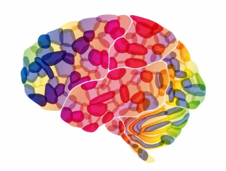
How Color Affects the Brain
Swiss psychiatrist, Carl Jung, believed that people have deep, special connections with colors.
“Humans have universal, bodily responses to color stimuli,” he claimed, “colors are the mother tongue of the subconscious.”
His ideas, spiritual as they may sound, paved the way for a multitude of scientific studies into the psychology behind color.
As has since been discovered, colors give rise to a diverse range of responses within the cerebral cortex of the brain.
Scientists attribute these emotional tendencies to evolution.
As written in the Proceedings of the National Academy of Sciences of the USA,
“Sometimes colors send an ‘approach signal’ (e.g. the colors of a flower attracting pollinating insects), and sometimes they send an ‘avoid signal’ (e.g. the colors of a poisonous toad deterring predators).”
As soon as a color is identified, in fact, chemical reactions spark inside our brains that give rise to emotional responses.
Oftentimes, we aren’t even aware that judgements are being formulated. They are governed very commonly by tiny little signals bouncing around our cerebral matter.
In the context of branding, colors may send signals to a person’s brain telling them either to purchase a product and steer well away from it.
It is, therefore, vital that your color scheme entices and attracts potential customers to invest in your brand.
Colors such as red, blue and green can evoke positive emotions in viewers that encourage them to make purchases, while others, like black and dark yellow, can be off-putting and have the opposite effect.
(See “How Individual Colors Evoke Different Responses” for more on different colors and their effects.)
How Different Wavelengths Create Different Emotions
In reality, ‘color’, is nothing more than a construct of our society.
Our optic nerves have evolved to detect certain frequencies of light, and these frequencies cause us to see different shades of color for which we have assigned values and labels.
Within this spectrum of light, however, deeper emotional responses can be triggered.
Longer wavelengths such as red can trigger faster responses in the brain whilst shorter wavelengths like blue can be calming and soothing.
Color can have a significant impact not only on the way we feel, but also how our body functions. So much so, in fact, that shorter frequencies have even been shown to lower blood pressure in some cases.
Identity and Familiarity
A study entitled “Exciting Red and Competent Blue” found that color can impact the success of a brand in other ways, too.
The authors of the study showed that color and typography can alter brand personality and purchase intent by effecting familiarity.
For example, big, bold yellow lettering effectively represent IKEA, whilst Apple customers rely on sleek, black and white imagery to identify the brand.
Without these predictable characteristics, such brands would be far less recognisable and would lack personality.
If designed appropriately, coloration can enhance the familiarity of brands and effectively shape its identity.
What do the Statistics Say About Branding Colors?
Following on from Jung’s hypothesis, a wealth of scientific studies have now been conducted, providing innumerable statistics based on coloration and brand success.
Below are some statistics about color:
- A signature color can increase brand recognition by 80%.
- 33% of the top 100 brands use blue in their logo, 29% use blue and 28% use black or grayscale colors.
- 90% of all purchasing choices are made subconsciously and based upon emotional responses, often triggered by color.
- 62-90% of appearance-based judgements are formulated due to color alone.
- Up to 90% of snap judgements made about products are based upon color alone.
How do Colors Influence Brand Perception?
As discussed earlier, different colors can significantly influence the way that a brand is perceived. But color doesn’t always affect all people in the same way.
Some subgroups and cultures may derive different meanings from the same color.
The Color Preferences of Different Subgroups and Cultures
Gender
Many studies have shown gender to have a significant impact on the psychology of color.
Though both men and women often like cool, calming colors such as blue and green, opposing genders frequently differ in their color preferences.
Stereotypically, men prefer darker, more “masculine” colors such as dark blue and deep green while women take a liking to lighter pastel colors, like pink, mauve and and yellow.
These differences are not set in stone and, as many groups fight for the renunciation of such ideals, are becoming increasingly less common.
It is important, however, to take note of these when deciding on your brand’s color scheme.
Age
Age can have a significant impact on color preference for a number of reasons.
Previously, it was thought that young infants and babies were colorblind, unable to distinguish between varying pigmentations.
This idea has since been disproven. According to modern research, babies aren’t only able to detect color, but they also appear to favour particular colors over others.
In several studies, babies have demonstrated striking preferences for just one color, while others favour a few colors – most frequently blue, red, orange and purple.
Whether due to social conditioning or individuality, these preferences often change during adulthood to reflect the gender-specific favourites previously discussed.
Culture
Color may also have cultural connotations, too, according to a study conducted by Schloss and Palmer.
In their study, Americans, Japanese and Mexicans were assessed on their color preferences. Results showed that taste in color varied across the nations:
- It was found that Americans typically favour cooler hues over warmer ones and an aversion to brown and olive pigments.
- Japanese participants also displayed these preferences but had a stronger preference for lighter, pastel-like colors.
- Lastly, Mexican participants preferred neither warmer nor cooler hues, but had an equal liking for both, as well as liking both saturated and lighter colors.
Oftentimes, particular colors signify varying emotions and themes across different cultures, too.
In the West, white is often used to indicate purity and innocence. In China, however, the color white represents mourning and death.
The research into cultural preferences for different colors hasn’t gone unnoticed.
Often, brands planning to branch out and become multinational alter their color schemes to match the relevant nation’s tastes.
Though color preferences are, for the most part, universal, it is important take note of the aforementioned differences when deciding on your brand’s color scheme.
How Individual Colors Evoke Different Responses
With the exception of the cultural variations discussed previously, Faber Birren’s findings were correct. Particular colors are widely known to evoke the same responses amongst different groups of people.

Let’s talk through these.
Red: Red is a very emotionally intense color. It has been known to enhance metabolism, increase respiratory rate and raise blood pressure.
Red stimulates feelings of passion and excitement, often creating a sense of urgency and impulse within people. In a branding sense, red may encourage a potential buyer to make quick purchasing decisions without much contemplation.
Many large brands make use of the color red for this reason. Coca Cola, KFC and Nintendo all use red in their logos. Brands like Netflix, YouTube and Adobe contrast red with white, creating bold, striking artwork where red is the focal point
Red should be used as an accent color and to stimulate quick decision-making; it’s perfect for coloring imperative statements, too, like ‘Buy now!’ or ‘Click here’. Red is also great for promoting activity-related products, as it symbolises energy and impulse.
Blue: Blue has long been linked to feelings of serenity and peace. Blue is the color of the sky and the sea and is often associated with depth and stability.
In contrast to red, blue has been shown to slow down human metabolism and lower blood pressure, relaxing both mind and body. Meditation companies such as Calm harness blue’s soothing powers to represent their brand’s personality and identity.
Blue has several non-emotional connotations, too, often used to depict cleanliness, health and aquatics.
Lighter blues are best suited to promote products related to sanitation, water, stability and relaxation.
Unlike emotionally warm colors such as red and orange, dark blue better depicts intellect and consciousness. It works well when promoting precision and accuracy in tech-related products.
Lastly, blue should not be used when promoting food and cooking as it is known to suppress appetite.
Green: Green is commonly associated with earth and nature. It symbolises life, growth and fertility, as well as safety and health.
Known to heal and improve vision, green is a restful color with strong positive connotations. Green is also linked with hospitals and medicine.
Green can be used to indicate safety when advertising medicinal products. It is also great for promoting environment-related ventures, such as ‘green’, eco-friendly products.
Duller, darker greens may better suited to money-related products as they reflect colors of cash notes.
Yellow: The color of sunshine, yellow is a happy, positive hue commonly associated with joy and intellect.
Generally, yellow has a warming effect, arousing cheerfulness, stimulating mental activity and generating muscular energy.
Bright yellows are effective in catching people’s attention, which is why many warning signs and taxis display lettering in bold, yellow tones.
Due to its pleasant, positive nature, yellow can be used when promoting children’s products and any object linked to leisure.
Yellow is often received as a lighthearted, playful color and usually isn’t appropriate when advertising prestigious, high-end products.
In contrast to blue, yellow evokes spontaneity rather than stability and should not be used when promoting safety-related products. In combination with black, however, yellow can effectively be used to display warning notices.
Overuse of yellow can, however, have a disconcerting effect; it is known that babies cry most frequently in yellower rooms.
Furthermore, dark yellow can depict dirtiness and poor hygiene, hence why lighter tones are more frequently used.
Orange: A combination of the qualities of both red and yellow, orange amalgamates energy with light and positivity. Orange can effectively represent happiness, creativity and stimulation.
Orange and red are often used to depict heat, though orange is softer and less aggressive than red.
Known to increase oxygen supply to the brain, orange can stimulate mental activity and promote action. In heraldry, orange evokes strength and perseverance.
Orange is a very visible color. It can be used to attract attention to particular areas of a design. It is also effective in promoting products related to concentration, happiness and intellect.
Purple: Merging the stability of blue with the stimulation of red, purple evokes power and luxury.
Purple is often associated with wealth and affluence, as well as wisdom, independence and mysticism.
Many young children take a strong liking to the color purple, with almost three quarters of pre-adolescents favoring purple over any other color.
Light purples are feminine and can be used to promote products intended to be sold to women. Darker tones can evoke gloom and sadness, as well as anger and frustration
Black: Black is commonly associated with power, mystery and death.
It is often considered a very elite, prestigious color (black suit and tie, cars etc.) used to denote formality.
Black foreground colors can present as bold and striking, yet minimalistic at the same time.
Black backgrounds can be used to make foreground colors stand out (such as white on black). In combination with white, black can also be used to effectively create a simplistic, minimalist color scheme.
White: In Western culture, white evokes purity and sanctity, while in China, white can indicate death.
White often depicts cleanliness and safety, too. In direct contrast to black, white generally has strongly positive connotations, depicting faith and perfection.
White can be used to denote simplicity, as well as coolness and cleanliness. Used commonly by charitable organisations, white represents angelic, divine ideals and can denote goodness and benevolence.
Choosing the Right Colors for Your Brand Image
There is no doubt that color is crucial to the success of a brand.
But how exactly can an entrepreneur, manager or salesperson make the most of the above information and choose a color that will maximise their brand’s success?
Take the Challenge
Research clearly shows that color can influence our decisions in many ways, but it doesn’t take an artist to select a color scheme.
As Leslie Harrington, author of a Ph.D. entitled ‘Color Strategy: Leveraging Color to add and Extract Values for Products and Brands’, writes:
“Color has been one of those things that’s been left up to the designer to select something. The CEOs or management say ‘Oh, I can’t do that, I’m not artistic enough.’ But my argument is that it’s not about being artistic – it’s not any different than making any other strategic decision for your business.”
And she’s correct. With the right pointers in mind and some careful consideration, anybody can decide on their brand’s color scheme, without having to employ an artist.
“It doesn’t cost you any more to make the right color decision for your product,” writes Harrington, “But if you choose the wrong color, from the onset, you’re not going to communicate what you want to your customer.”
Simply put, your brand coloration is a heavily weighted decision. It doesn’t take an artist, but it certainly does require research, time and consideration.
Identify Your Focus
What’s the primary focus of your brand?
Is it to generate leads? Drive sales? Increase your mailing list?
Your brand’s goals and aims should be the driving factors in determining which color scheme to select.
By ensuring that these colors align with the fundamental objectives of your brand, you will maximise its success by evoking emotion and promoting brand recognition.
Brands such as Virgin and Coca-Cola adopt bold, red color schemes because their primary aim is to generate sales. Red, as discussed earlier, encourages rapid decision-making. Richard Branson and Muhtar Kent leveraged these facts to maximise the success of their businesses.
And you should do the same. Identify your goals and ensure that these align the colors that you select to represent your brand.
Know Your Identity
Color is an incredibly powerful way to shape your brand’s identity.
Companies such as Facebook and HP use passive blue tones to symbolise stability, intellect and freedom. Their color schemes effectively reflect what that particular brand is about; what it represents and how customers can benefit from it.
It’s crucial that your color scheme aligns with the personality of your brand. This will enhance its familiarity, maximising its long-term success by promoting recognition.
Consider how you’d like your brand to be perceived by those viewing it and ensure that your color scheme matches these desires.
Putting Together Your Color Palette
The next step is to go ahead and form a color scheme geared to maximise the success of your brand.
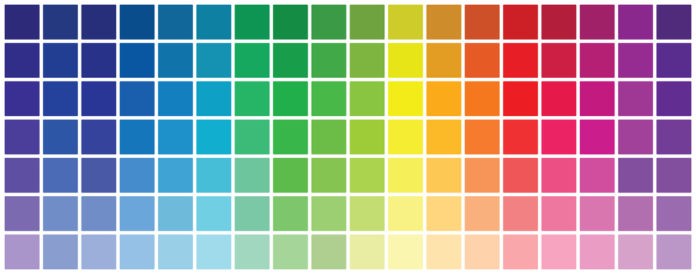
Here’s how.
Step 1. Creating a Mood Board
Once you have an idea of which colors you wish to use in your palette, you can go ahead and select a handful of tones that will form your brand’s identity.
Pinterest is an excellent platform through which to gather inspiration.
With a couple of colors in mind, you can create a secret Pinterest board and begin adding pictures of brand color schemes you like the look of.
As you accumulate inspirational images, begin to identify color similarities. Start making notes of colors that you like and could incorporate into your brand.
Aim to select around 6 colors that you like the look of. These will form your color palette: a selection of colors used most frequently to represent your brand.
You don’t have to stick to 6 if it doesn’t suit your aesthetic. More or less is fine, so long as they work well together.
Step 2. Determining Your Color Combinations
The color wheel should play a big role in how you develop your brand’s color palette.
There are 3 primary color combinations that your color palette could follow.
Monochromatic color palettes feature varying tints of a single color. This can create a subtle and minimalistic feel, though can sometimes lack contrast and appear bland.
Analogous color palettes feature colors that are near each other on the color wheel. They are closely- related and complement one another. Warm colors that sit on the same sides of the color wheel work best to form analogous color palettes.
Complementary colors sit at opposite ends of the color wheel, such as blue and orange. This type of coloration can create more dimension and balance in a brand, forcing colors to ‘pop’ and stand out.
Step 3. Use Both Light and Dark Colors
Ensure that your brand’s color scheme does not lack contrast. A mixture of light, dark and medium tones will add depth and professionality to your brand.
If your color wheel is lacking at least one darker and one lighter color, add black or white to existing colors to adjust their contrast.
Step 4. Choosing Dominant Colors and Accent Colors
Once you’ve put together your color palette, it’s time to decide on some dominant and accent colors.
You probably won’t use every color in your palette for every product, item, logo and art piece. For this reason, it’s wise to determine which colors you will use most frequently and which you will use as accents.
Accent colors won’t be used often, rather to make particular elements stand out amongst others and to add variation to your brand.
Accents may be bolder in color, distinctive from the other colors of your brand.
More Helpful Tools for Choosing You Brand’s Colors
There are a number of invaluable tools available online that can help you to select the right colors for your brand.
- Colr.org allows you to import photographs of color schemes that you like the look of and generate color palettes based on your favourite tones.
- Adobe Color CC, formerly known as Adobe Kuler, lets you try out and save various color themes. These can then be directly exported into other pieces of software like Adobe Photoshop or Illustrator. Adobe Color CC is an invaluable tool to use when creating a color wheel for your brand.
- Check My Colors is a tool that’s designed to check foreground and background color combinations for sufficient contrast – particularly people that have color-identifying deficits. This can help to ensure that colors comply with WCAG guidelines.
- Designspiration allows you to select up to five colors that you like the look of and will then generate images with that color combination. You can then easily select your favourite combinations and save their hex codes to use for your own brand.
- Coolors is a quick color palette generator that can be used to instantaneously create color schemes for your brand. With little experience, you can quickly explore color schemes created by other designers and copy them for your own brand.
- Colormind generates color schemes both manually and randomly and allows you to learn more about each color in the palette. You can also see how colors look with certain UI components like buttons and and tabs.
- Colordot is a simple and easy color scheme generator that enables you to instantly generate color schemes based on your preferences. If you already have a good idea of the colors you’d like to use, Colordot allows you to quickly lay these out.
Conclusion
Whether you’re creating a product, launching an app or designing you brand’s artwork, the color scheme you choose to adopt could significantly impact its chances of succeeding.
With the right tools and careful consideration, you can ensure that you get your color scheme right first time.
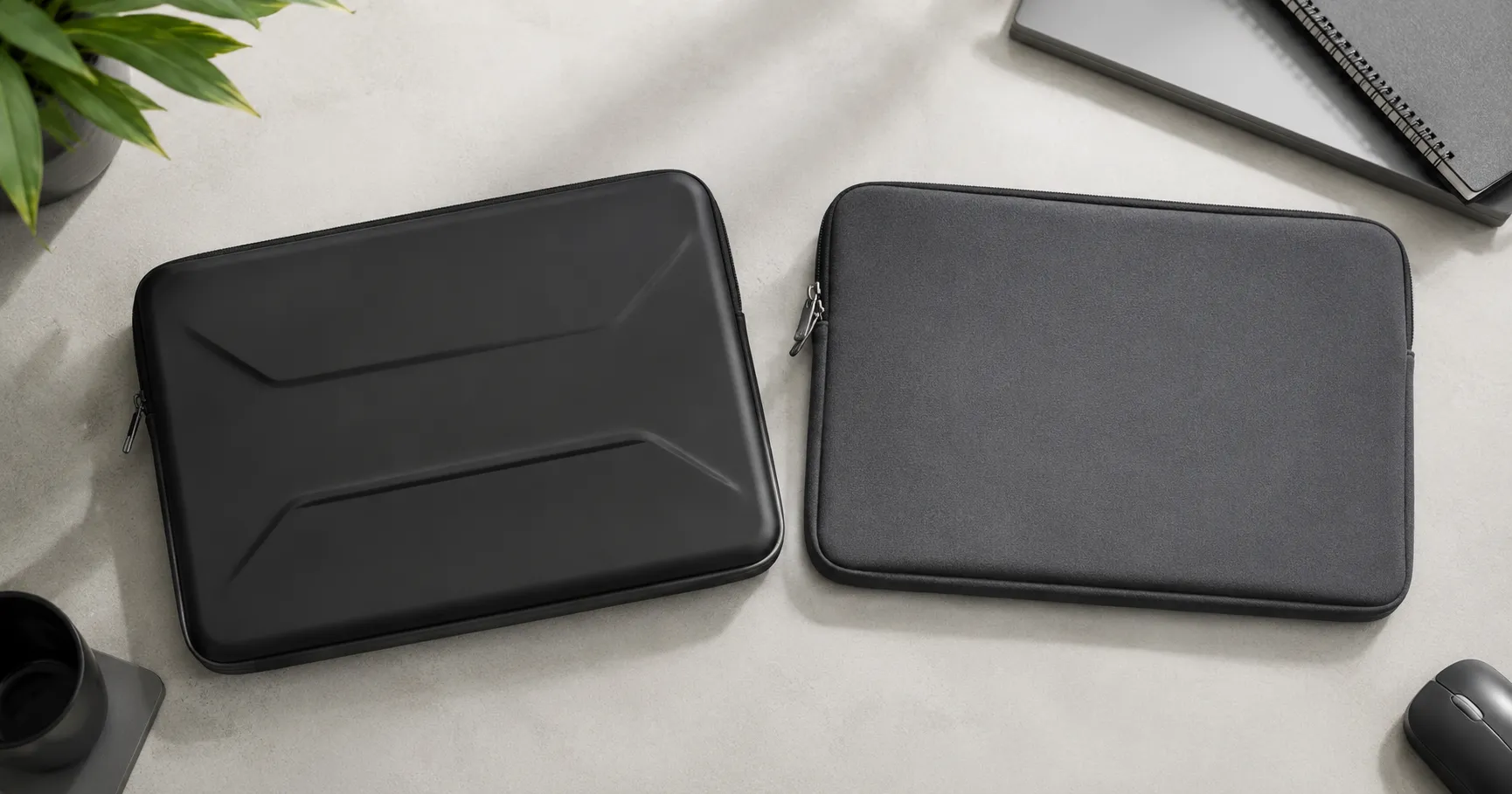
Once you’ve finished with your brand colors, think about getting some Custom Branded Cases, Covers and Sleeves for your business. CustomLogoCases makes a large range of Cases and Sleeves, for all devices, and are experts in applying your branding and brand image to these accessories, to help promote your business.


It's the MOST wonderful time of the year at Custom Logo Cases! We're hard at work preparing custom sleeves and cases for the upcoming 2026-2027 school year. Beat the summer rush and order now for delivery before school starts! 📚✏📗🧳🚌🏫
#backtoschool #schoollife #SchoolYearReady #SchoolTechnology #laptopbag #chromebookbag #macbookcase ... See MoreSee Less
Call Now
We just donated to DonorsChoose fully funding multiple requests ahead of the FY 25-26 school year close. Countless schools need assistance and you can help too! Check out DonorsChoose today and see how you can make a teachers job easier and spark magic in the classroom. 🫶🙏 ... See MoreSee Less
DonorsChoose: Support a classroom. Build a future.
www.donorschoose.org
DonorsChoose connects teachers in high-need communities with donors who want to help.🚨 Attention K-12 Tech Directors & Admins! 🚨
Secure your 2026-2027 deployment before the summer rush.
We just launched our new, ultra-rugged 360° Protection Case built specifically for K-12 Chromebooks and the Apple Neo.
Why This Case?
Drop-Proof: Military-grade 360-degree shock absorption.
Student-Proof: Reinforced corners and pick-resistant port covers.
Versatile: Full rotation for tablet and laptop modes.
⏱️ Act Fast for August Delivery ‼️‼️
Supply chains tighten drastically by June. Order by May 31st to guarantee delivery and tagging before students return this August 2026. ... See MoreSee Less
Call Now