


Your average large-sized ecommerce site has the potential to increase their conversion rate by 35.26%.
Imagine increasing your conversion rate by that much.
Would be pretty sweet, right? Of course.
In this article, we look at the advice from renowned experts on how humans naturally behave when you’re trying to trigger an action, and what you can do to help achieve your desired result.
We’ll go deep, and have a discussion on the main reasons people are abandoning carts and the techniques you can use to decrease the number of people leaving your site at key moments.
[no_toc]
What is Checkout Cart Conversion Rate?
It’s defined as the percentage of visitors who land on your site and complete a desired action.
For your ecommerce website, your conversion rate is the percentage of visitors who bought something from you in a set period of time.
The purpose is so you can see how many visitors are turned into buyers.
How to Calculate Your Checkout Cart Conversion Rate
Number of Orders ÷ Number of Visits = Conversion Rate.
Here’s an example:
If your ecommerce store is generating 2000 orders and has 20,000 visitors, your conversion rate is 1%.
What is Checkout Cart Abandonment?
It’s an ecommerce term used to describe a visitor who’s left your site before completing a desired action.
In this case, it’s I’m referring to users who added items to your shopping cart, but left without completing the order.
How to Discover and Calculate Your Checkout Cart Abandonment Rate
Before you start taking action and implementing tactics, you should determine what your current abandonment rate is.
There’s an easy way and a hard way.
The hard way would be to manually look at your the total number of completed purchases and divide this by the total number of carts created. Then multiply the result by 100.
Example: If you had 45 completed purchases and 200 carts created, your sum will look like this: (45 / 200) x 100 = 77.5%
The easy way:
Just set up a Google Analytics Enhanced ecommerce tracking.
Once you’ve done that, go to Conversions > Ecommerce > Shopping Behavior to find your cart abandonment rate.
If you haven’t already set this up, do.
You’ll also get access to insightful reports:
- Shopping Behavior
- Checkout Behavior
- Product Lists Performance
- Sales Performance
If you think you’re abandonment rate is high, don’t worry–it’s normal. Check out this list of abandonment rates and you might feel better.
You’re also able to use this tool to discover any problem areas in your checkout flow:
Navigate to Conversion > Goals > Goal Flow to see your report.
What Are the Reasons Shopping Carts Get Abandoned?
It’s a simple fact of life:
In the ecommerce business, a large portion of cart abandonments are a natural consequence of how people browse websites.
Many will window shop, compare prices, save products for later, and explore gift options etc.
Unfortunately, these are largely unavoidable.
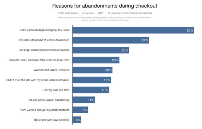
Baymard’s study on checkout cart abandonments found 58.6% of online US shoppers have abandoned their cart within the past 3 months because they were just browsing.
In fact, most will leave before they’ve even entered your checkout flow.
If we remove this reason from their research, we are left with this:
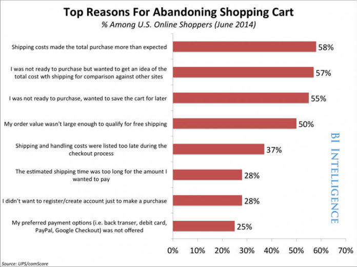
Now, I don’t want to just trust one source of information, so let’s take a look at other studies done.
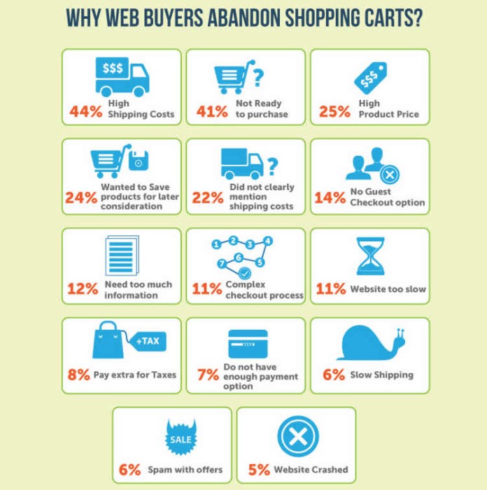
When you remove the “just browsing” element, you can see a lot of these user issues can be resolved with design.
And it’s the same issues popping up again and again.
In fact, conversion expert, Bryan Eisenberg, argues the three primary design problems are:
- They fail to reduce fear.
- They fail to build trust and credibility.
- They fail to reinforce benefits.
And when you look at the previous research done, you can clearly see the reasons fit one or more of these three design problem.
Where do you start?
With Fogg’s Behavior Model.
What Triggers Human Behavior? (Fogg’s Behavior Model)
This is going to the very basics of human behavior and how we take action.
Which, after all, is what you’re aiming for.
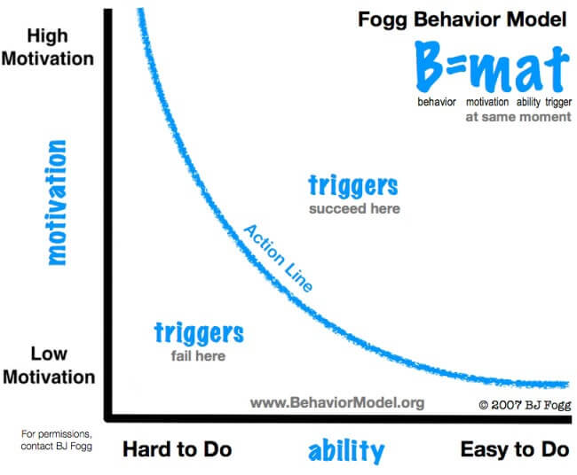
Behavior = motivation x ability x trigger.
If your potential buyer has a high motivation to buy, but it’s difficult for them to do it, they’ll become frustrated.
If they have low motivation, but it’s easy to do, they’ll get annoyed.
Your aim is to have your checkout cart flow to be right at the top of this graph.
High motivation + simple to do + trigger.
Tying Together What We Know So Far
Okay, so you’re now at the point where you understand your checkout cart flow needs to reduce fear, build trust, and reinforce benefits.
Whilst at the same time being an easy process for your users.
Now, you could make assumptions and guess how you can improve this. But, what I recommend, is you conduct your own qualitative research and get real feedback from your customers.
What we’re both going to discuss now, are the proven ways you can apply both Bryan Eisenberg’s three design issues and Fogg’s behavior model to improve your checkout cart conversion rate.
How You Can Reduce Checkout Cart Fear
By fear, I don’t mean they’re really scared. Rather, it concerns your user’s inner dialogue:
“Why do you need my mobile number?”
“They might call me when I don’t want”
“Can I trust you with my credit card number?”
“Is my information going to be secure?”
“Am I getting the best deal available?”
“When will my shipment arrive?”
Brian Eisenberg suggests the checkout forms fail to reduce fear in the following ways:
- Asking for more information than required.
- Asking for sensitive information before your visitor feels comfortable.
- Your form is too long, looks intimidating, or is unclear on how many steps it will take to complete.
- You don’t reinforce the fact they’re getting the best deal possible.
- You don’t handle errors and field validations well.
Let’s look at the different ways you can reduce fear based on you now know.
Is it Worth Experimenting with a Single-Page Checkout Form?
There’s a lot of debate on what’s better: single or multi-page.
In theory, a single-page checkout forms make sense:
- They seem shorter so customers have extra incentive to complete the transaction.
- They require fewer clicks.
- Fewer clicks can make your user less likely to leave your ecommerce site.
It does produce results:
Elastic Path’s A/B test case study discovered a single-page checkout for the Olympic Store converted 21.8% higher than a similar multi-page checkout.
However…
Invespcro ran a test for a furniture retailer with a high AOV (over $2000), and found out a multi=page checkout converted 38% higher than a single-page checkout.
It’s clearly not a one-size-fits-all case.
UseabilityGeek state it depends on the products you sell and the type of persona your customer is.
Single-page checkouts tend to perform better if you your average order value is low or if you’re selling impulse purchases.
The best thing for you to do is run an A/B test and see which works best for you.
And keep this in mind when looking at (or designing) your checkout form:
- Is it clean (de-cluttered)?
- Are you only asking for necessary information?
- Does your form leverage Google’s autofill forms?
- Does it auto-detect credit card type from the first four digits?
For example, if you’re selling an info product, there’s no need to ask for their address.
Use a Progress Progress Indicator
By using a progress indicator, you’re going to eliminate your users fear of not know how many steps it will take to complete the checkout process.
There’s a powerful physiological reason behind progress indicators.
In the notorious paper “The importance of percent-done progress indicators for computer-human interfaces,” Dr, Brad Myers concludes people prefer to have progress indicators.
And this benefits your checkout form.
Because as humans, we are driven to have goals (your case, they want to buy the product), and then accomplish the goals (buying the product).
Here’s an example:
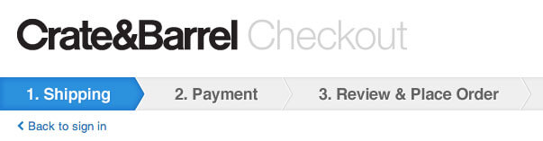
It makes it crystal clear to users checkout is a three-step process, making the experience less intimidating.
Don’t Force Your User to Create an Account
People are becoming more and more wary of sharing their private information with you.
This study found 30% of users abandoned their carts when asked to sign-up before checkout.
Now, I understand you still want users to sign-up, so you can try to approach this in three ways:
- When a user makes a purchase, automatically create an account and assign a random password and email the information to then with the order receipt.
- Ask your users to sign-up on your ‘Thank You’ page after they make the purchase.
- Offer your user an incentive to sign up. E.g., make it clear checkout will be faster.
But don’t force it.
Always offer an option to checkout as a guest.
Toms is an excellent example:
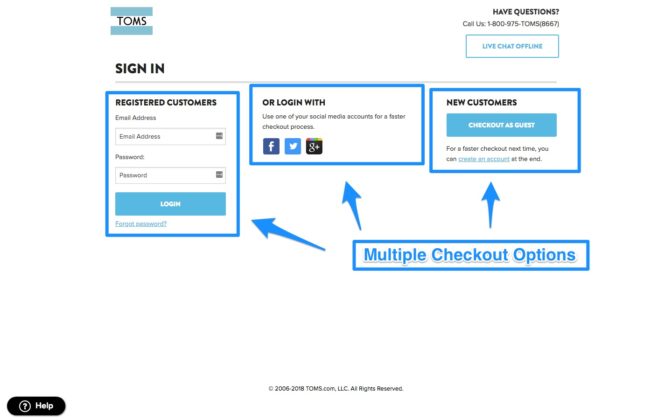
Users are given an array of options.
They can sign in using Facebook, Twitter, and Gmail. Create an account, or skip all sign-up methods and checkout as a guest.
When ASOS only changed their checkout flow to allow users to checkout as guest, they were able to increase their conversion by 50%.
Discount Codes & Coupon Boxes
This can be used to help ease your user’s fear of not getting the best deal.
However, there is a wrong and right way to doing this.
The wrong way:
Now, imagine you’ve got all the way to the checkout page, and you see an apply code for a discount.
What’s the first thing you’re going to do?
Head to Google and search for a discount code for this site.
I’m guilt of this.
And when I couldn’t find a code, generally, I didn’t go back to the site out of frustration.
Remember: High motivation + difficult to do = frustration.
The potential issues don’t stop there.
You might end up having to pay affiliate fees.
They might find a better deal on another site.
Both are unwanted.
Therefore, here are some tactics you could implement to prevent this:
1. The Hide & Seek Technique
Get Elastic’s Linda Bustos suggests only showing your promo code box to visitors who have a discount code.
Here are the two ways she recommends you handle this:
- When your customer comes to your site via an affiliate link or email with promotion, your URL should include a parameter saying they have a promo code. When they get to the checkout page, the parameter is looked up in the session and the box is displayed.
2. The URL parameter includes the promo cade, and it’s automatically applied at checkout.
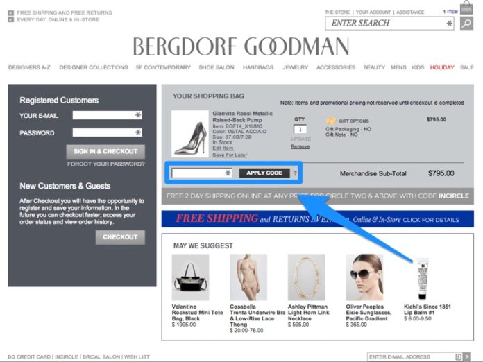
2. The Stay on my Site Tactic
This involves you making it easy for your customer to see discount codes on your website.
Here’s an example of how Macy have done it:
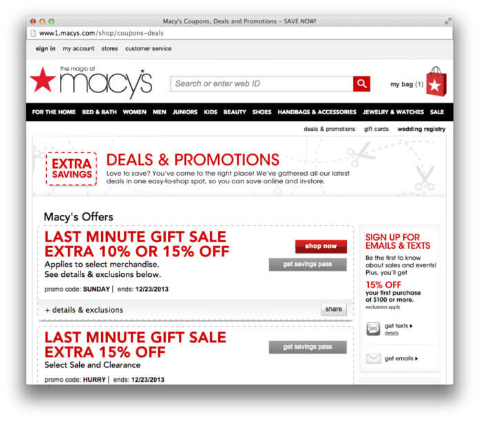
They use a very simple ‘find one now’ button next to the promo code box. When you click on it, it opens up a new window where you can see all available discounts without leaving the checkout page.
This can reduce the amount of visitors lost by going off-site to search for one.
And the idea of having coupons on your site has academic support:
This study showed, when discounts were present, shoppers were less likely to search for a lower price elsewhere.
3. Reciprocity Tactic
This one is very simple.
The tactic is to offer exclusive coupons in exchange for an email opt-in. If your user abandons their cart, you’ve already captured their email for future marketing.
But, wait.
You could switch this up and try leveraging reciprocity.
Instead of asking for an email, you could say something like, “We don’t normally do this, but if you increase your order by X, you’ll get X% discount.
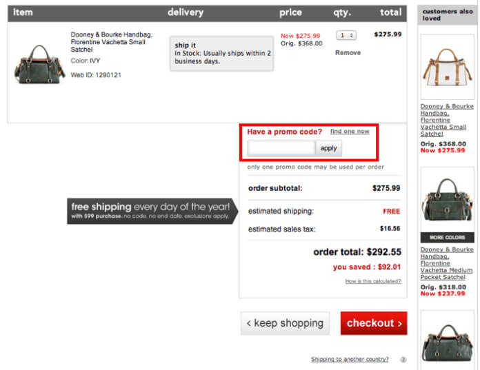
Clearly Show All Charges
Remember Baymard’s research: 60% of people abandon their shopping cart due to extra costs being too high. And 23% of people abandoned because they couldn’t clearly see/ calculate the total order costs.
You definitely don’t want to surprise your users with shipping costs or taxes.
Be as obvious as you can possible be.
If you have high shipping costs, and you’re worried it will turn users away, try incorporating some of the shipping cost into the cost of the product.
But, really you need to be offering free shipping.
Stat: E-tailing Group’s study showed 73% of surveyed individuals mentioned free shipping is necessary when it comes to making an online purchase.
Pretty much everyone knows they’ll need to pay some form of tax on an item. But, the sum might offer a nasty surprise.
And sometimes, people forget they need to pay it and don’t expect it.
Here’s what you can do:
- Install a sales tax calculator and have it easy for your users to find.
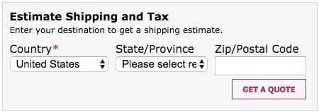
2. If you can’t install a tax calculator, include tax information in your product description. Again, make it super clear.
When it Comes to Reducing Fear…
You need to understand what is causing someone at the checkout page to think twice.
And although there are clear best practises, you never really know until you’ve done your own research and tested out techniques.
Use session tracking and heatmap tools to enable you to see how people are interacting with your checkout flow.
Inspectlet is a great example. And you can use this with other tools like Qualaroo to obtain your own primary qualitative feedback.
How You Can Build Trust and Credibility
Look:
Cybersource’s survey found 73% consumers feel shopping online is riskier than shopping offline.
More than 90% of visitors are jittery and concerned when shopping on new or unknown sites.
England’s Office of Fair Trading found 1 in 7 people experience problems with online shopping. Two-thirds are worried about unauthorized access to their personal information. And in total, 50% of people who used ecommerce were worried about being conned.
It’s not your fault people feel this way. Or maybe it is… I don’t know you.
Approximately 99% of customers will end relationships with companies who fail to build customer trust.
This section on trust and credibility is very closely related to fear, and this directly builds on the previous points we’ve discussed.
What you Need to Consider When it Comes to Trust and Credibility
- Do you clearly reinforce to your user you are credible and trustworthy?
- Is it obvious to your users they’re in a secure browser environment?
- Have you leveraged these trust messages at the point of action?
- Are you telling users what you’re going to do with the information you’re collection.
- Are you reminding them you value their privacy?
Let’s take a look at how you can tackle these.
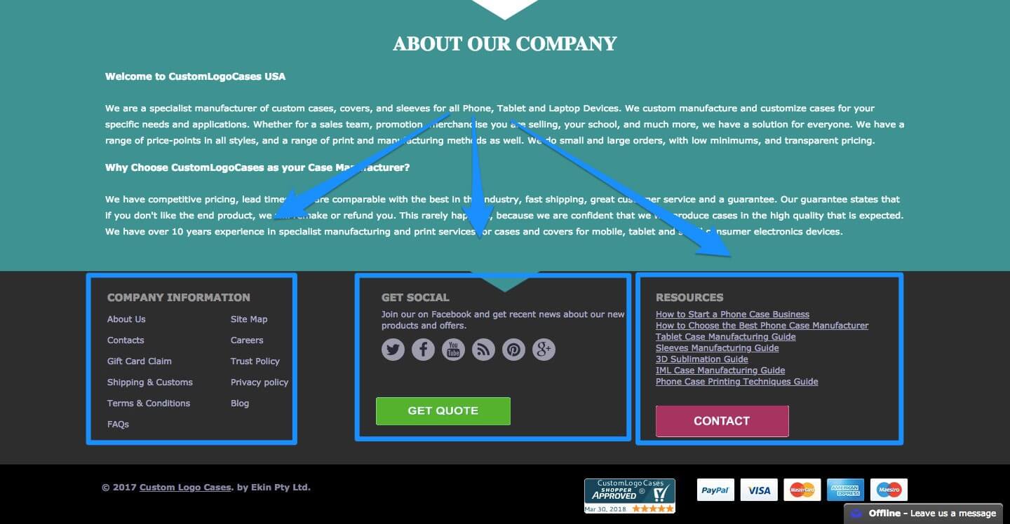
1. Have Your Contact Information Clear for All to See
Make it as obvious as possible.
This way, your customers will know they can contact you. And you’re not going to take off with their money.
Here’s an example:
At the top of each page, we have our contact number. And it’s the same in the footer:
2. Add SSL Certificates and Trust Badges
Possibly one of the best way you can clearly show your user your business is trustworthy.
Most trust badges are associated with SSL (Secure Socket Layer). I’m not going to go into detail, because it can get very complicated. But, here’s what they do:
SSL is a global standard security technology, enabling encrypted communication between a browser and server.
They decrease the risk of sensitive information (credit card numbers, usernames, passwords, emails, phone numbers etc.), from being stolen or tampered with by unsavory groups or individuals.
SSL creates a private channel between two parties: You and your customer.
Stat: Central Reservation Service increased conversions by 30% after adding Verisign.
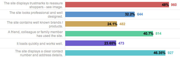
Which badges do people recognize the most? Good question.
Actual Insights researched this by asking consumers questions about the recognition and trust of different badges.
Use the slider below to see a heat map showing the results.
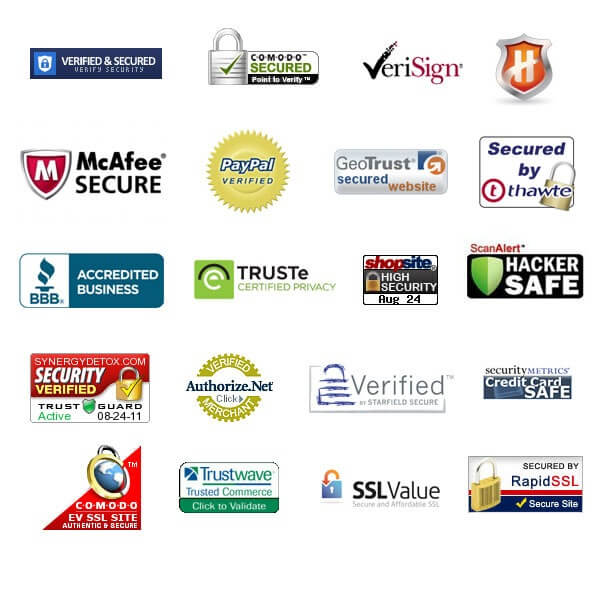
Original
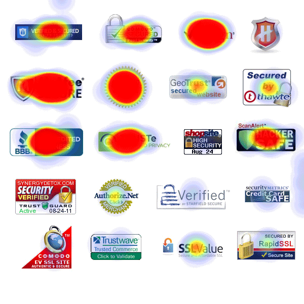
Modified
And when you compare this study to Baymard’s:
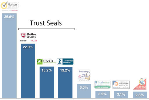
You can see it’s the same badges on top.
3. Trust and Credibility Isn’t Just About Badges
Simple things, like providing clear information your user will want to see at points of action.
Like shipping methods:
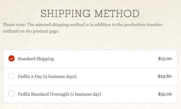
Looking at this, you have no clue on how long it’s going to take for you to receive your order.
This will force you to abandon your checkout and go looking for the details.
You might also think… “why are they hiding this?” It definitely doesn’t help build trust and credibility by hiding key information at action points.
4. Add Reassurances at the Final Checkout Button
This is something you can easily do.
Here’s an example:
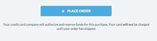
ThinkGeek uses some simple copy under the ‘Place Order’ button to add reassurances to their customers.
ASOS reminds their user’s they value their privacy when to comes to creating an account:
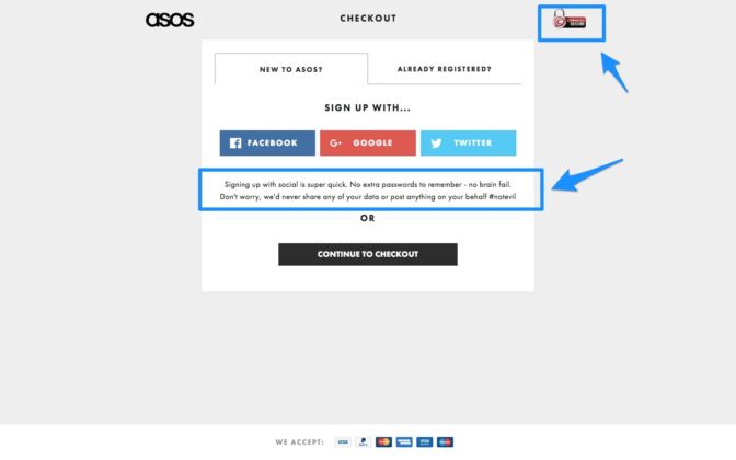
They also have their trust badge on show in the top right corner.
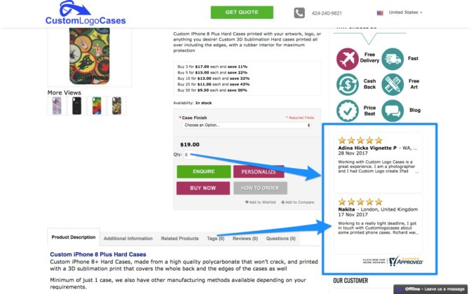
5. Leverage Customer Reviews
According to eMarketer, customer reviews are one of the top factors in building trust.
So how can you do this?
Here’s how:
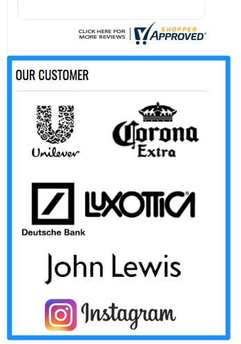
If you work with big, recognizable brands–shout about it:
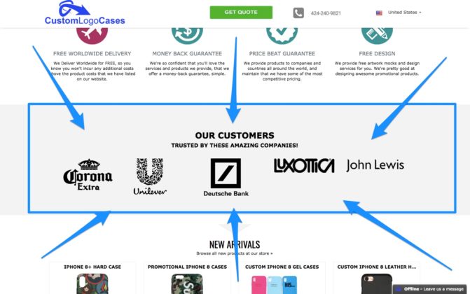
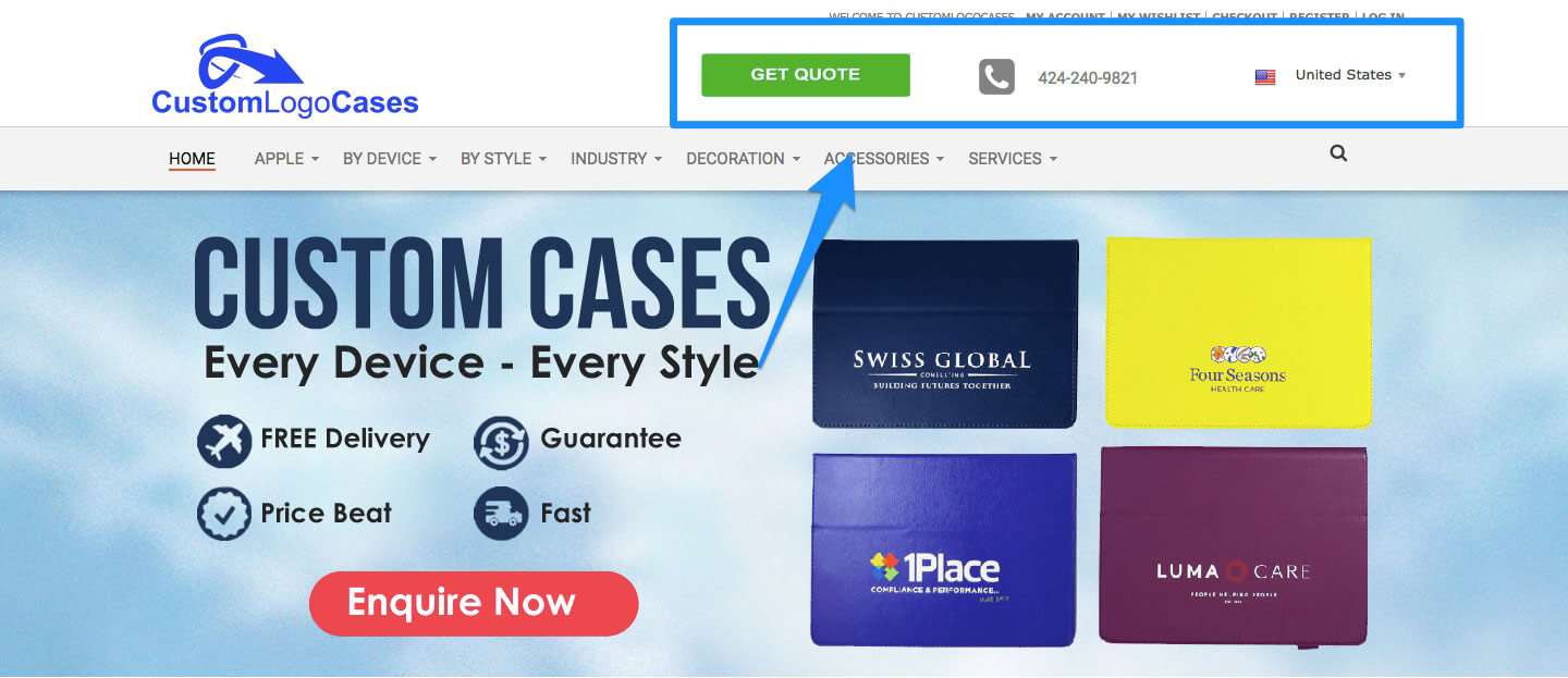
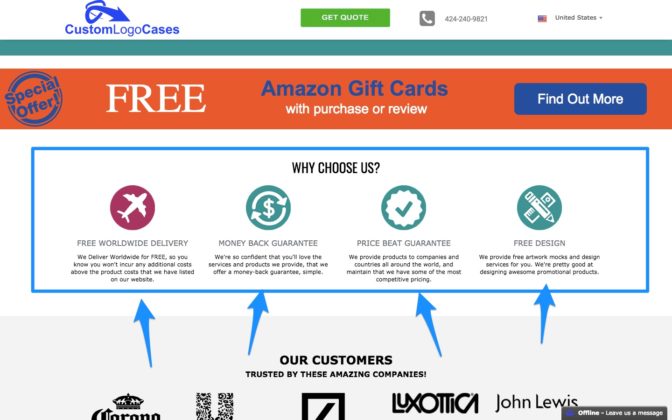
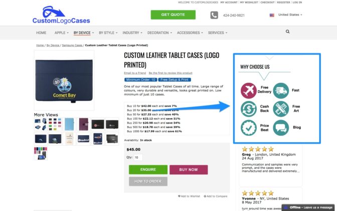
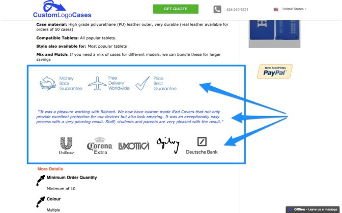
This is what we do at CustomLogoCases. We make it very clear to our customers we’ve worked with huge companies to help reinforce trust and credibility.
We then show customer reviews on all product pages along with our recognizable brands:
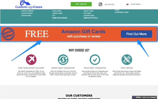
And if you’re struggling to get reviews, try offering an incentive.
We offer users a free Amazon gift voucher with every purchase or review to encourage engagement:
6. Include Thumbnail Images
Unless your customer is on a mad shopping spree, it’s unlikely they’re going to forget what’s in their shopping cart.
When you’re in a store, you know what you’re buying because it’s right there in your hands.
The ecommerce experience is different.
Like the progress indicator we discussed, including a thumbnail of the products in their cart can help reassure your custom of what they’re buying from you.
At the same time, you’re also removing the possibility they could become hesitant if they can’t immediately remember what they’re purchasing.
Here’s how we do it:
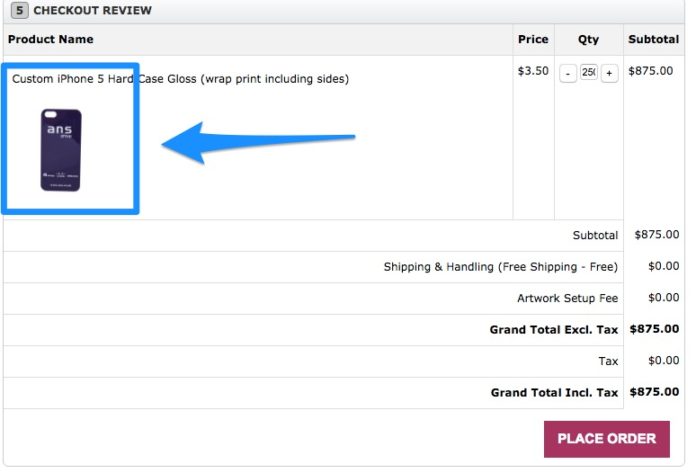
This screenshot is taken from our checkout process.
The small, but easily identifiable thumbnail of the product reminds the user exactly what they’re purchasing.
When it Comes to Building Trust and Credibility…
There’s a lot more you could consider, like “trust web design”. However, this is a very broad subject.
But here’s the main point…
Consistently build trust throughout your user’s experience, then reinforce just how trustworthy you are at decision points to help trigger your desired action.
How You Can Reinforce Benefits
Again, this section builds on the previous two.
Are you constantly telling your customers how fantastic it is to do business with you?
Now, we’ve already spoken about some tactics that cross over into this section.
For example, customer reviews will help build trust, but also act as an indicator to your user other customers had an excellent experience.
1. Tell Customers How Fantastic You Are
User’s love free shipping. We’ve both seen that from all the research studies I’ve cited in this article.
So make it obvious.
Here’s how we do it:
On our homepage, out users will instantly see we offer free, fast delivery.
But we don’t stop there.
Scroll down, and you’ll see this:
Again, we tell users exactly why it’s great to do business with us.
Then again on the Category Page:
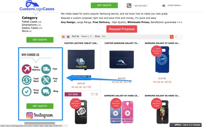
And on the product page:
We then display this on the sidebar in category pages and product pages.
And in all our product description, we again reinforce the benefits.
2. Sweat the Small Stuff
Yes, take the small things into account.
Think about the copy you’re using. If you’re asking someone for their email, are you asking them if they want to subscribe? Or are you telling them why they should subscribe?
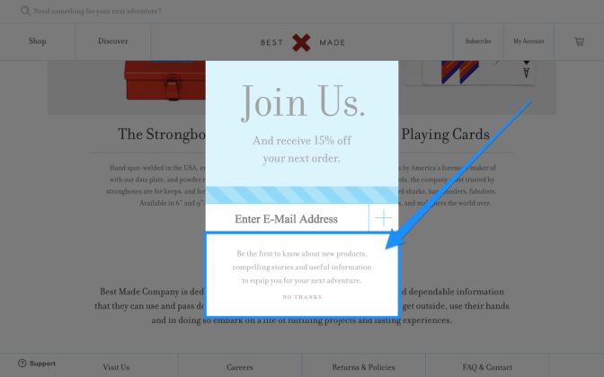
BestMade does this very well:
Yes, it’s super-awesome they’re offering 15% off in exchange for your email. But look at what it says underneath.
“Be the first to know about new products, compelling stories and useful information to equip you for your next adventure.”
It tells the user exactly why it’s great to handover their email address.
3. Reinforce any Benefits on The Checkout Page
ASOS is an excellent example of this:
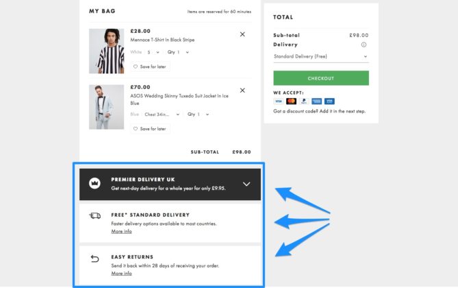
When you’re about to checkout, they’re telling you again the benefits.
ModCloth is another excellent example:
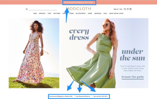
They display that they offer free shipping for all orders over $75 on their home, product, and category pages.
Then when you add products to your cart, this happens:
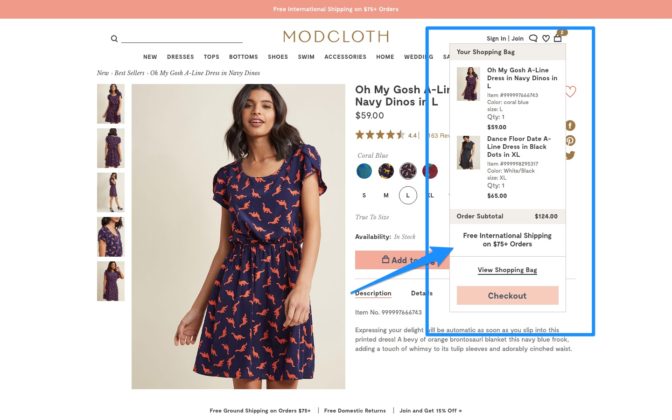
You get another reminder of the free shipping on all orders over $75.
Oh, by the way, I’m not purchasing women’s clothes–promise.
Key Takeaways
If you’ve ever overlooked the basics, don’t worry.
It’s very easy to forget customers consciously and subconsciously scrutinize your checkout process.
What it comes down to, start with nailing the basics: reduce fear, build trust, and reinforce why it’s great to do business with you.
If you’re doing that, you’ll naturally follow Dr Fogg’s behavior model.
Of course, there are a huge number of ways you can further optimize your checkout flow, so here are some great resources you can use:
https://www.wordstream.com/blog/ws/2016/03/17/shopping-cart-abandonment
https://usabilitygeek.com/7-remarkably-simple-methods-boost-checkout-conversion-rates/
https://blog.lemonstand.com/9-case-studies-for-optimising-your-checkout-conversion-rate/
https://vwo.com/blog/reduce-ecommerce-shopping-fears/


We just donated to DonorsChoose fully funding multiple requests ahead of the FY 25-26 school year close. Countless schools need assistance and you can help too! Check out DonorsChoose today and see how you can make a teachers job easier and spark magic in the classroom. 🫶🙏 ... See MoreSee Less
DonorsChoose: Support a classroom. Build a future.
www.donorschoose.org
DonorsChoose connects teachers in high-need communities with donors who want to help.🚨 Attention K-12 Tech Directors & Admins! 🚨
Secure your 2026-2027 deployment before the summer rush.
We just launched our new, ultra-rugged 360° Protection Case built specifically for K-12 Chromebooks and the Apple Neo.
Why This Case?
Drop-Proof: Military-grade 360-degree shock absorption.
Student-Proof: Reinforced corners and pick-resistant port covers.
Versatile: Full rotation for tablet and laptop modes.
⏱️ Act Fast for August Delivery ‼️‼️
Supply chains tighten drastically by June. Order by May 31st to guarantee delivery and tagging before students return this August 2026. ... See MoreSee Less
Call Now
... See MoreSee Less